Please Stand By
Web server doing weird things. Lots of issues. May have to delete/reinstall WP. Don’t worry, doing backups, but site may be up, down, up, down for the next couple days.
Web server doing weird things. Lots of issues. May have to delete/reinstall WP. Don’t worry, doing backups, but site may be up, down, up, down for the next couple days.
I fully realized I hadn’t posted in about 3 weeks, and I really wasn’t that concerned. Late fall and early winter are kind of down seasons for me, at least historically. I’ve trimmed back my video game binging to merely a game or two, baseball cards have ended most production runs for the year, the holidays happen whether we want them to or not, and work generally grinds to a halt. That would be the perfect time for reflection and insight into the year thus far, but the lack of motivation usually takes it’s toll.
I’m also unsatisfied with my own web projects in general (don’t worry, it happens every year). About now I start noticing how dated my designs looks, I contemplate redesigning it, and it’s pretty much a 50/50 that I actually get around to it. This year in particular my general design is bothering me. It’s bland. It’s lacking any visual interest, probably because it was intended to emphasize text and fontography, which I then ignored. It’s also minimalistic, which of course was the trend at the time I rolled it out. That’s the problem with trends, they die. Currently, “massive fonts” and “full screen images” are in. Don’t worry, not going in that direction.
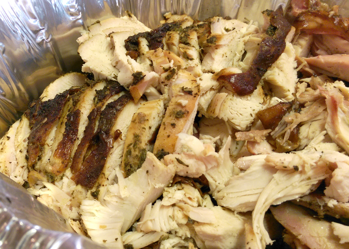
Oh, and I also smoked a turkey for Thanksgiving. How’s that for a random segueway?
I think I had mentioned my love for the barbeque arts in passing on previous posts. It’s gotten slightly out of hand. I’m smoking whole briskets and pork shoulders now. My pulled pork is actually quite good. I’m catering a small party next weekend. Go figure.
The turkey was actually pretty easy. Quick Simon & Garfunkel rub (Parsley, Sage, Rosemary and Thyme, get it?) inside and out, and some butter injected into the breasts. Smoked at 325° for 2 ½ hours with apple wood. Easy as pie. Nice and golden and crispy on the skin, smoked and juicy on the inside. Completely blew our previous fried turkeys out of the water.

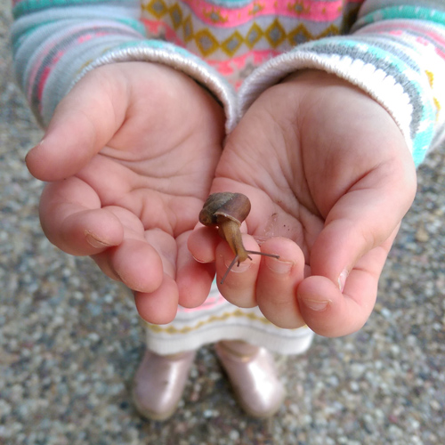
While the turkey was awesome, the highlight of the day was my kiddo finding snails in the backyard. She’s completely fearless, and just all around awesome. Not that a snail would hurt anyone, but most girls would run away screaming. I’m a proud daddy.
After dinner I settled in for some traditional Call of Duty. I’m actually pleased with this years offering. It’s clear what the extra year of production time did for it’s development. I don’t think you’d get anyone is disagree that Advantaced Warfare is far more polished that the previous few years. It’s good to get that fix of “twitch” shooter back. I had been missing it for quite a while. It’s like wearing that old comfortable hoodie, the one you just dug out of the closet because the weather is finally cold enough to wear it. Turkey, apple pie, and headshots, what could be better?
There have been some baseball cards purchased over the past few weeks. Most of them are going towards a rainbow that I’m nearly finished with. I’ll tease it with the best of the bunch, and you can clearly see why. Puns!
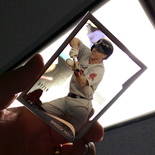
Yeah, that’s pretty sweet.
There’s not really that much else going on. I’d post more cards if I actually cared about any of the sets released in the last couple weeks. What I should do is round everything up and make some end of the year checklists for things I’m missing. There we go, I just gave myself a to-do list. That might actually get done. The website redesign, meh, 50/50.
In case you haven’t noticed, or are reading this through a RSS feed reader, the blog got a little update today. There were a bunch of reasons why, but primarily for security. The theme I had been using was full of security holes and old depreciated plugins. I had dodged a couple previous bullets with people trying to hack in but this time I wasn’t so lucky. Someone exploited a PHP hole and injected some evilness into one of my plugins. My host caught it nearly immediately, but in the 3 minutes it was there the person turned off notifications (so I would get emails about new users), registered themselves as an admin, and injected code into just about a half dozen PHP files. I spent most of today cleaning up the mess.
The real kicker is that my passwords are strong, unique, and 30+ characters. My passwords are all different and never reused. WordPress itself was completely up to date, as were the major of the plugins I use. It was the old theme that let them in. They exploited the only hole they could find. Let that be a lesson, nothing is 100%. I installed a couple additional plugins as well, just to help things a long. A security suite that actively bans IP ranges with failed login attempts, as well as one for traffic monitoring and a service for cloud backups.
That leads us to the theme, which is new. Among other things, it allows for some newer bells and whistles. The Cards page now has dropdowns for the sections and the About page has a little CSS trickery, to name a few. I’ll be messing with it more over time.
That’s all for now.
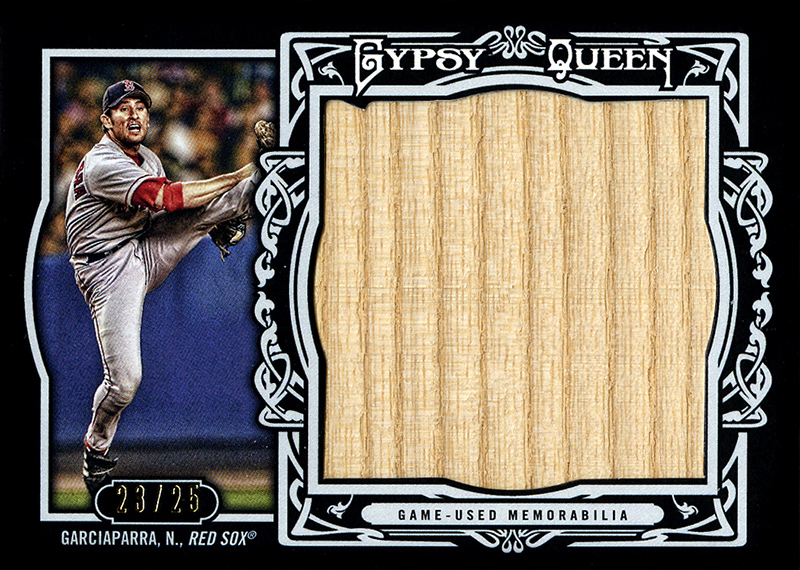
I’m just going to put that beauty right up there on top, so I can talk about it and what it took to get it. 2013 Gypsy Queen Nomar Garciaparra jumbo bat relic, #23/25. The story isn’t so much about this card, but the card that was supposed to be.
A week or so after GQ launched this year, some guy on Reddit, my daily (and constant) source of procrastination, posted in /r/baseballcards that he “got lucky” and got 2 jumbo relics in a single hobby pack. Topps is clearly known for their highest quality in regards to collation, so I couldn’t help but feel the part about the single pack was full of crap (he said, dripping with sarcasm). That should have been my first red flag but I was blinded by the Nomar and, regardless of how many packs he got them in, he did in fact have 2 jumbo relics. He had #19/25 of the Nomar pictured above, as well as a Cabrera jumbo jersey relic. While most of the posters were falling over themselves to make him offers on the latest Triple Crown winner, I sent him a PM about the Nomar.
He said he was looking to sell it, that he doesn’t really open anything other than Flagship and that his GQ packs were just kind of a random purchase. He didn’t really collect much, so he didn’t want anything in trade (second red flag) but would take Paypal for it.
I thought about it for 0.00002 seconds and made him, what I felt at the time, was an appropriate offer. $35. His card had a small crease just above Nomar’s head and I didn’t feel comfortable offering more than that. At the time, there was only one other on ebay and was “Buy it Now” at $40. He agreed, thought it was a fair price and we sent messages back and forth with our details. It was a done deal, or so I thought.
This was a Thursday afternoon, and I was getting paid on Friday so I decided to wait until the morning to send him the money. It was a good thing that I did.
Having drooled over the very idea of this card when I first saw it on the checklist, I had an ebay alert set up for anything matching it. The only entry was the aforementioned $40 BiN. That night, after dinner, I got an email from ebay. A new card matched my search criteria. It was #19/25. The seller’s username was also identical to the reddit user.
At first I thought it was a fluke. Maybe he was listing it so I could buy it from him and we’d do the transaction within Ebay. Buyers/sellers protection, all that jazz. Then I checked the auction. The starting bid was set at $49.00.
I sent him a message. No reply.
Friday, Saturday, Sunday went by. It was only a 5 day auction. The bidding hit $55, then $59.
Monday morning I got a short reply from him, saying, in a nutshell. “Screws you dood, I gettin more money for it on ebay”.
There was still a day or two left. I could seriously mess with his ebay auction. The thought crossed my mind of creating multiple accounts and creating a fictional “bidding war”, raising the price of the card into the thousands, then walking away from those accounts, forcing him to re-list it, over and over again.
I won’t lie, those thoughts crossed my mind.
I didn’t do that though. I took the high road.
I told him I’m glad he got what he could for it, and wished him well in his collecting.
Two days later, I get another email. Another card matches my search criteria. #23/25, starting at $0.99.
EXACTLY $34.99 later, including shipping ($32 + $2.99), and it’s mine.
I saved a penny, and still felt good about myself.
Let that be a lesson kids.
Never attempt to buy cards from random internet strangers, and card-karma is a very very real thing.
I have this thing about seeing incredibly easy to do things that people are charging money for. I can’t stand it when people apply a blue filter to a photo, save it as an action, then sell that action for $10. Drives me right up a wall. I’m a DIY kind of guy, and so my other strange little hobby is actually recreating some of those fairly easy effects. Mostly Photoshop actions and layer styles, Lightroom presets, that sort of thing. When I saw these for $6, and someone on Reddit asking for similar, I knew I had to recreate them. So, 15 minutes later…

Made with CS5, saved with editable layers. Edit, print and enjoy.
If you’re wondering what on earth these are, they’re case art replacements for Xbox and PS3 games, designed to look like old school Penguin Books book covers. Now you can display your game collection right in the living room and your non-geek friends will think you’ve got a huge collection of classic paperbacks.
Not that it affects any of you in any way, but my last post was #1750. That’s not a significant number outside of it being just something I wanted to point out. After 1750 posts, and 12 years, for the first time I’m turning on page caching. That’s a good thing. I got a friendly email from my host last night that a significant increase in traffic to my site over the last six months has also increased load times and server resource usage. And it was legitimate usage as well, not some runaway script or resource hogging plugin. That means you fine folks are visiting, and visiting often.
I’m not going to insinuate that I know what I’m doing, or that I’m any sort of blog expert. I would also never bore you to death with self-aggrandizing posts about how to have a “popular” blog. That’s all horse shit. No pretentious crap here, no patting myself on the back for keeping at something long enough to “not suck”.
I simply wanted to say thank you.
Thank you.
Thank you to everyone who reads any of this. Thank you to the random people who just stop by from other blogs. Thank you to faithful and regular readers. Thank you for indulging my idiosyncrasies and politically and socially incorrect ramblings for this long. You guys are awesome.
That is all. Forward unto dawn.
Recent Comments