by Matt | Mar 23, 2017 | Cards
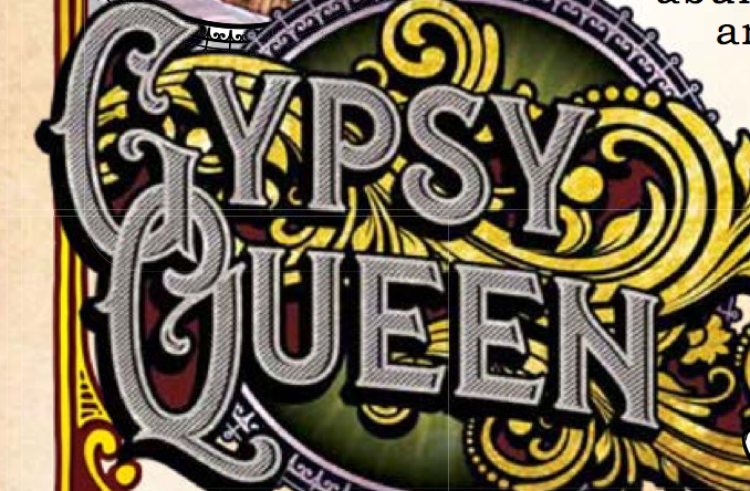
With the release of 2017 Gypsy Queen a week or so away, I’ve been preparing my now-traditional “recreation” of the cards. It’s a fun exercise for me as a designer. I try and deconstruct a card, it’s design elements, font choices, photography effects, etc. It’s a way to exercise that creative part of my brain. Yesterday Topps updated the “sell sheet” and released a more-or-less final checklist before the products launch, which is fueling this design breakdown. PDFs, in case you weren’t aware, are considerably easier to pick apart than low-res JPGs they normally put out for previews.
If you have no interest in what fonts Topps is using this year, feel free to tune out for while. For those of you who might be curious, let’s rip into this puppy.
(more…)
by Matt | Mar 10, 2017 | Cards
Topps Heritage is completely unacceptable this year. It’s nuts, and I’m not playing it’s stupid game. Last week, after failing to find ANY Heritage, in any form, in any store, because logical distribution in a major metropolitan areas is apparently too hard, I turned to eBay for a team set. A base team set was $3.99, which got me 18 cards base cards. Do you have any idea how many more there are to find, or would be if I was even interested any more? There are SIX freaking shortprint cards and nearly 30 inserts. I can live without the inserts, that’s not the end of the world. What is completely unacceptable though, is that the MAJORITY of the starting lineup for the Red Sox is a short print. I saw only two sellers offering “Master Sets” when the product launched. One of them wanted $45 and the other wanted $50. Not happening. Not for a team set.
Chris Sale, David Ortiz, Mookie Betts, Xander Bogaerts, Dustin Pedroia, Jackie Bradley Jr, and David Price are all short printed. After a brief glance at the checklist I’m willing to bet that if in the last 5 years a player was on an All-Star team, or is a hot rookie of some sort, their card is probably short printed. It’s not just my team either. You’ve got your Kris Bryant, Jose Altuve, Correa, Stanton, Strasburg, Goldschmidt, Bautista, Sanchez, Syndergaard, Hamels, etc, etc, that are ALL SHORT PRINTS.
You know how much sellers are looking for for a short print? $2-5, each. I am not paying $30+ for 6 cards when I paid $4 for EIGHTEEN! That of course, also doesn’t cover the awesome $3.50-3.75 most sellers are now charging for shipping (which, I understand, is a lot of eBays fault). So, $5-8.75 per short print??? Not happening. NEVER happening.
I’m not upset that there are short prints, we’re never going to get Topps to stop doing that. What I’m most upset about is that it was a conscience choice to put, literally, the most popular players behind an artificial “scarcity” barrier, for every team, throughout the product. You want to SSP some weird colored parallels, fine. You want an hard to find SSSSP action variation of a RC, fine. Just stop making everyday and starting lineup players artificially shorted. That’s just bullshit.
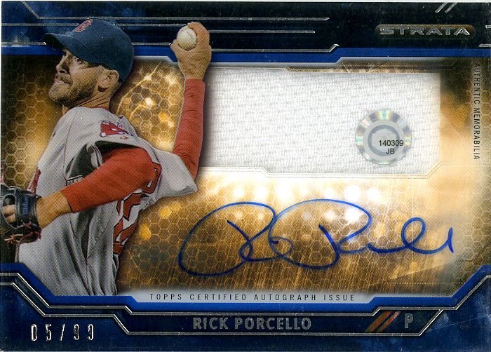
Think about the Sox starting lineup. Out of the 9 most obvious players in the lineup, I can easily find Hanley Ramirez and Rick Porcello base cards. Everyone else in the 1-400 checklist is either a bench player, or a #3-5 starting pitcher. That’s some serious bullshit.
Think about YOUR team’s starting lineup. How many of them are short-printed? Let’s pick one at random. How about the Nats? Scherzer, Strausburg, Harper, Murphy and Turner are SPs. That’s 5. Want to do another? How about the Tigers? Verlander, Cabrera, Upton, Kinsler, Fulmer and Norris, that’s 6. You can see my point.
I just can’t support something like this. I was never crazy about the ’68 design, but this just soured me on the entire product. Sorry Topps, just not taking the bait this year.
by Matt | Feb 21, 2017 | Cards
Two weekends ago I snuck off to the Houston Tristar card show for a couple hours. In all honestly, it was pretty disappointing. Most vendors packed up early and went home, leaving people wondering around a half empty hall Sunday afternoon, which was of course the day I had time to go. I got there about 1:30 and allegedly the show was open until 6pm, which I swore was what they had listed on the website. When I bought the ticket to go in and handed it to the guy at the door he turned and look at the other security personnel and said “well, that’s probably about all we’ll get, I guess pack up the turnstiles.” What? If I had waited 5 more minutes I could have just walked in, and saved my $12. The security literally left the door when I came in. Ok, “maybe they’re just paying them for half the day”, I thought. I know this goes until 6.
An hour later I’m looking through some dime boxes and the guy starts putting the lids on the boxes I’m not looking through. “Are you leaving?” I ask. “Yeah, I’ve got a long drive and I’m leaving at 3”. Oh, ok. I finish up, pay like $4 for a stack of cards and he throws everything on a dolly and heads for the door. I go to another vendor, start looking through his boxes. He actually makes me an offer on the entire box ($100, didn’t take it) so he won’t have to pack it up. By 3:30 over half the vendors, and most of the ones I was going to look through, were gone.
Aggravated, I walk over to the fudge and beef jerky vendor. Why there’s a fudge and jerky vendor at a card show I’ll never know, but there they are. I ask them what time the show ends. They say 4pm. At this point it’s still 3:30 and I’m determined to at least find something worth the $24 (12 and 12, parking and entry) I paid just to come to this stupid thing. Here’s what I found in the little time I could actually find something to look through.
(more…)
by Matt | Feb 17, 2017 | Baseball, Cards
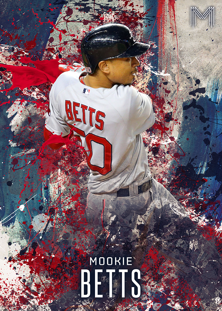
I wanted to try something a little different with a custom I was working on. For the longest time I’ve enjoyed seeing the work of a fellow by the name of Tyson Beck. You might not recognize the name right off the bat, but you’d probably recognize his work. Topps hired him to work on the “Fire” brand of inserts and cards. The overall look of the “Fire” brand of cards changes from year to year, but on the whole they usually involve both geometric abstracts as well as paint/dust/particle effects. Some would say “paint splatter”, others “grunge and dust”, I just call it fantastic and inspirational. I was using the “Fire” inserts specifically from 2016 Update Baseball as inspiration.
So, with that said, and with literally 100 different “paint” brushes in photoshop, I came up with this…
by Matt | Jan 25, 2017 | Cards
I’ve said many times before that I’m not a “box buster”. To date I’ve probably opened about 10 in my entire collecting life. It’s not that I don’t want to, it’s simply that a $75-100 gamble vs a $2 sure bet is a no-brainer. I’ll buy cheap cards all day long provided I know what I’m getting. Busting a box, to me, is the collecting equivalent of gambling. I just don’t have money to waste, every dollar is precious, so I like to get the most return for my money. That said, it is fun to do, especially when someone else bought the box. This Christmas my parents decided to wonder through my Amazon wish-list and settled on a hobby box of 2016 Diamond Kings as my present. A very thoughtful gift that I appreciated and enjoyed opening. The box guaranteed two hits. In my opinion, I got five. Read on…
(more…)
Recent Comments