I’ve said many times before that I’m not a “box buster”. To date I’ve probably opened about 10 in my entire collecting life. It’s not that I don’t want to, it’s simply that a $75-100 gamble vs a $2 sure bet is a no-brainer. I’ll buy cheap cards all day long provided I know what I’m getting. Busting a box, to me, is the collecting equivalent of gambling. I just don’t have money to waste, every dollar is precious, so I like to get the most return for my money. That said, it is fun to do, especially when someone else bought the box. This Christmas my parents decided to wonder through my Amazon wish-list and settled on a hobby box of 2016 Diamond Kings as my present. A very thoughtful gift that I appreciated and enjoyed opening. The box guaranteed two hits. In my opinion, I got five. Read on…
It’s no secret that I love Diamond Kings. That’s why it was on my wish-list to begin with. Retro baseball art isn’t just in my wheelhouse, it defines my wheelhouse. Let’s check out some base cards.

The Sox from the box. That’s strait up Dr. Seuss. I love the inclusion of historic players (in sets where it’s appropriate). Can’t go wrong with a Ted, Papi and Mookie in the same box.
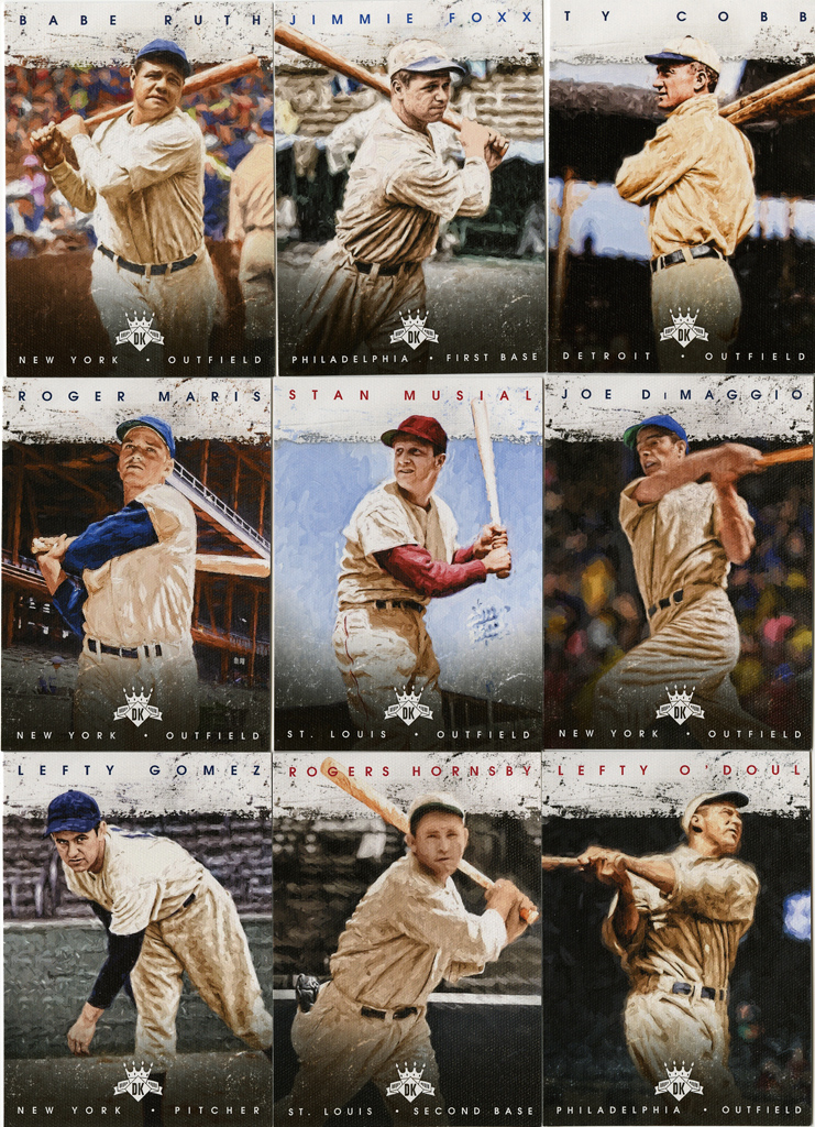
Speaking of historic players, a good portion of the set is dedicated to them. The first 50 cards in the checklist to be exact. The set is only 185 deep, so that’s a good percentage.
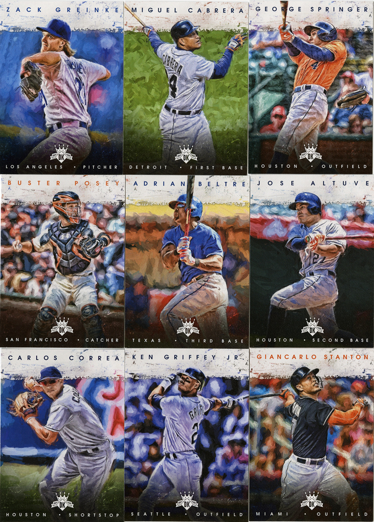
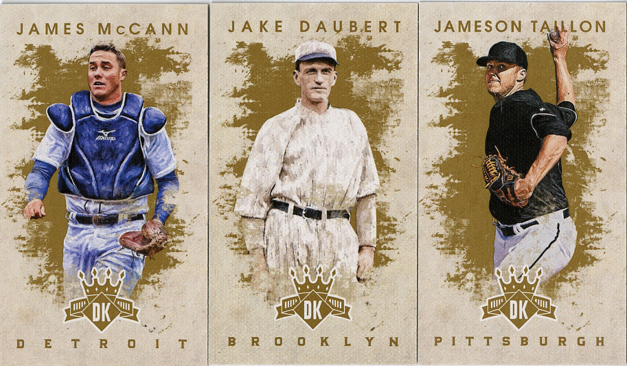
The rest of the set is modern and current players. Here’s a good cross-section.

The later third of the set (#’s 141-185) are reserved for rookies. Whether you care about licensing or not, there was a pretty significant rookie crop this year. Schwarber, Sanchez, Turner, Severino, etc. I’m not 100% sold on the “flipped” design for the rookies. It doesn’t bother me, it just doesn’t really seem necessary. You’ve already got a RC logo on there, do we really need to tweak the design to over-emphasize that rookie cards are “different” than the base cards?

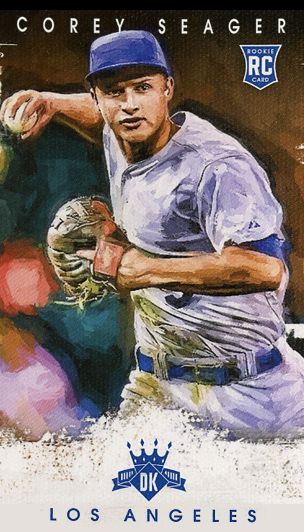
Here’s something I didn’t know before opening the box: there are apparently photo variation SSPs. When I was sorting them I realized I had two Corey Seager cards. Turns out one is a photo variation. There’s only 15 cards that got the variation treatment, and they are apparently tough pulls. The batting photo (left) is the variation, in case you wanted to know.
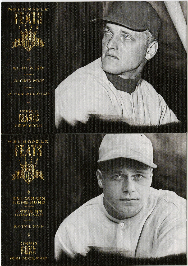
Let’s begin the Tour of Inserts with my least favorite. The “Memorable Feats” cards. Nothing wrong with a strong black and white photo, but the little tiny words on the left side are really hard to read when printed on textured paper. You can hardly read that Roger Maris hit “61 HR in 1961”. Hell, you can hardly read the “er” on the end of his first name. Weakest insert set in the box if you ask me. Good idea, poor execution.
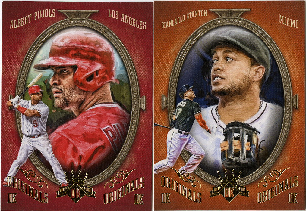
“DK Originals”, a little nod to the original “Diamond King” insert concept but in a more artistic framing. Not bad. Two solid cards in Pujols and Stanton.
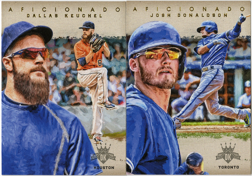
Next, the “Aficionado” cards. These were my favorite last year because they looked like the Expressionists set I’m going to show (below). This year they’re considerably more plain, yet clean. I like the juxtaposition of the close-up and the in-game images, I just wish they weren’t so similar.
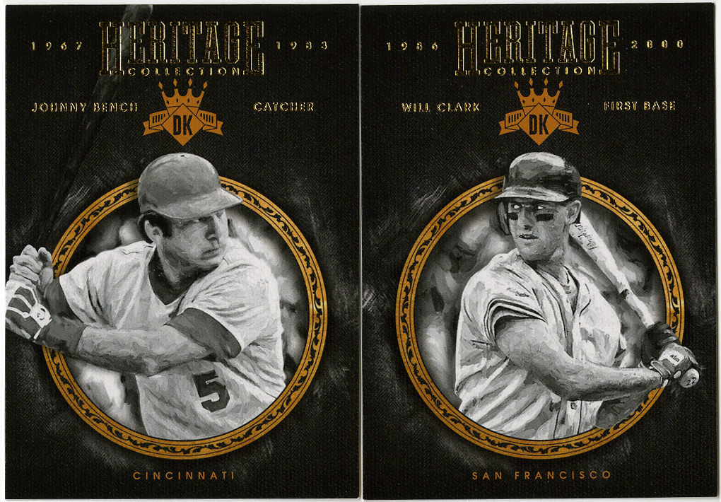
The “Heritage Collection” is up next. I guess I’m confused as to the purpose of this insert set. There’s only 20 cards in it, and it focuses on stars from the 70’s-90’s. Greg Maddux, Eddie Murray, Schmidt, Canseco, etc. I pulled Johnny Bench and Will Clark. Not bad cards, just not really sure why they needed a special insert set. Why not just include the players and make the base set 200 cards instead of 185? Who knows.
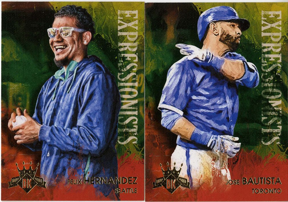
The aforementioned “Expressionists” set. Again, 20 cards, this time highlighting what I can only assume is “personality”. Guys that actually show emotion on the field. I’m squarely in the “Make Baseball Fun Again” camp, I don’t mind a few fist pumps and bat flips. Oddly, there’s no Bryce Harper included in the set, weird. Still, a fun little artsy set, playing off the “expressionist” painting idea. Probably my favorite inserts of the bunch. They could easily drop “Feats” and “Heritage” from the product entirely and I’d be just fine with the three remaining inserts.
Last but not least, I’m never sure whether to call mini cards “inserts” or “parallels”, so we’re going to use them as a transition between the base cards and the hits. Technically, there are more mini cards than base cards (208 vs 185), which makes 23 (seriously?) of them mini exclusives. Apparently that Jameson Tallon is one of them. He’s #198. Short print SP mini? Now, I love minis, probably unhealthily so, but there’s just something about the “poop colored” background on these that I can’t get past. The base cards don’t use that color, the base cards don’t use that design, it’s just, well… crappy. Like that the design intern put these together after someone forgot to do them in the first place.
Here, let me help you out Panini…
There. That took 30 seconds in Photoshop. Was that so hard?
Sigh. I digress. Back to the real cards.
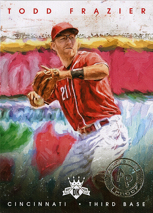
Now that we’re through the base cards and the inserts, it’s time to get to the meat of the box. I said at the top that the box was guaranteed to have two hits. I got those, and then some. I typically consider anything low numbered to be a hit. Therefore, something like this, an “Artists Proof” that happens to be a /25 “silver parallel”, I put into the hit category. The regular “Artists Proofs” are gold and #/99. This is considerably more rare.
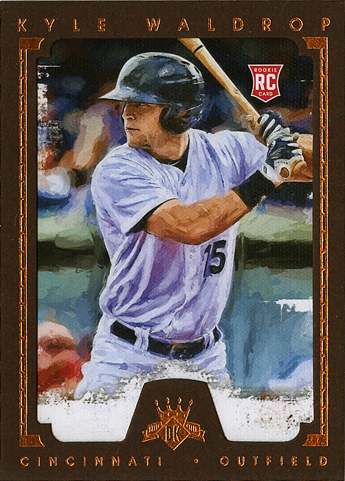
Here’s a red paper border parallel of Kyle Waldrop, #/99. I think he got traded to Seattle just a couple weeks ago.
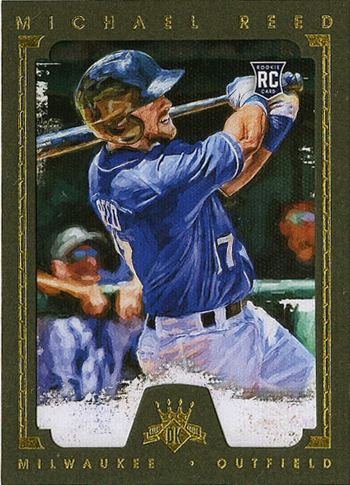
Now here’s a definite “hit” that’s not a hit. The green paper parallels in Diamond Kings are numbered out of 5. This is #1/5. Michael Reed is allegedly #27 in the top 100 prospects list at the moment. This might be interesting to hold on to and see if he develops. Still, anything numbered less than 5 is a pretty solid pull in my opinion.
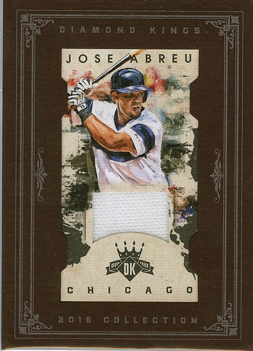
The “real” hits. A mini relic parallel for Jose Abreu, #/99. I like that they kept the front of the mini open, and used the paper frame to hold it in, but used clear acetate on the back to hold the whole thing together. It keeps it safe without losing the “paper” feel to the set on the front. That, and I’m a sucker for an art deco frame.
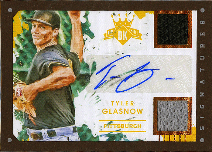
Last but not least, a duel relic auto for Tyler Glasnow of the Pirates, numbered /25. I understand why these are on stickers (writing on textured paper is tough), and I’m usually not bothered by stickers, but this one kind of sticks out to me. The whole set is “artistic” and made to look like paint and ink and real materials. Surely they could have signed these on-card, sloppy penmanship be damned. UD Masterpieces did it ten years ago, no excuse these days. Interesting card, but ultimately for a team I don’t collect. Oh well.
So, in summary, I love the general look and feel of the entire DK product. I like the retro, I like the artistic aspects, and if I had spent my own money on the box I would have been happy with what I would consider extra hits. The minis and the “meh” nature of my “big” hit kinda knock a few points off, but overall I really enjoyed opening this box. At a super low price point ($65-75 a box), I would consider buying another, if for no other reason that to try and finish the base set. Probably not (more like never) going to put together that mini set.
2016 Diamond Kings – 8/10
Recent Comments