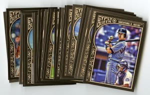
by Matt | Jun 12, 2015 | Cards, Personal
A week or two ago it was time for the annual Tristar Collectors Show in Houston. I never really go with a ton of cash, so I don’t make any huge purchases, but I do enjoy just thumbing through dime boxes for a couple hours. Truth be told, this year I think I ended up buying more supplies (about $40 worth of mag-holders) than I did cards. I think all together I spent about $35-40, including two completely overpriced cards I’ll mention in a minute.
I also ran into the now “Beckett famous” Tanner from “6,000,000 cards and counting” as I was walking in. I complemented him on his epic mustache and told him how I had enjoyed seeing the custom cards he had been creating over the time I had been reading his blog. He said thanks and I apologized for being some sort of random creepy “guy from the internet” and left him alone.
Anyway, you’re not here to see $40 in plastic holders, so I suppose I should get on with it…
(more…)
by Matt | Jun 3, 2015 | Cards
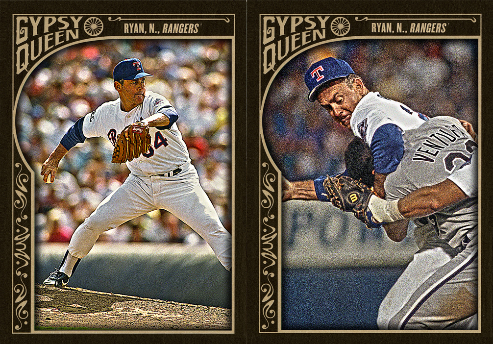
In case you missed the last post, I railed on a Nolan Ryan card in Gypsy Queen for being, well, completely terrible. Lest I be accused of starting trouble and not offering solutions, here you go.
What should have been. Nolan Ryan’s Gypsy Queen card, and bonus photo variation. Ha.

by Matt | Jun 3, 2015 | Aggravation, Cards
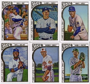
I complained about this last year, and I’m going to repeat myself and complain about it again this year. Why on earth is there no consistency in Gypsy Queen?
I’ll let you click on that and see it in it’s full-sized glory. See anything a bit off? Yeah, the printing job is terrible. The colors are all over the place. The only possible explanation is that they were printed by different printing houses, in different locations, and then combined when they were sorted and packed out. Even then, I can’t imagine there wasn’t a color reference sheet, or press checks, or just basic quality control. This stuff is kind of basic in the printing industry.
We do 10,000+ runs of corporate brochures and we check color and consistency before we start printing (by doing test runs), again once they start rolling off the press (for comparison) and again towards the middle and end to make sure it’s staying consistent. Pantone colors should match throughout the entire process.
These cards, these are something else. There are at least three (if not four) different colors in there. One really dark (far left), one that I believe to be correct (Nomar, far right), and ones that are considerably lighter mixed in.
Last year it was the colors of the backs, this year the problem has run over onto the fronts. That’s just the first of many issues. Let’s talk about photography and photo processing through Photoshop…

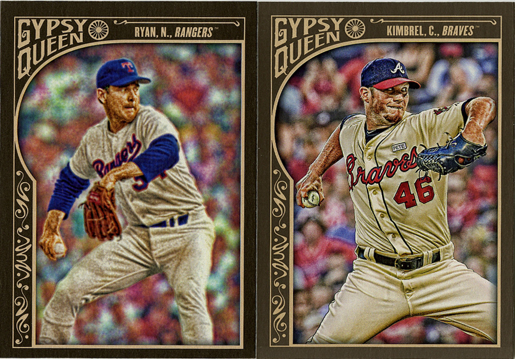
Here’s a perfect example. Two very similar cards (in composition and player body position), but look at the photos. The Kimbrell on the right is sharp as a tack. You can see the Rawlings logo on the ball and even the notch-holes on his belt. The filters they’ve used have been applied in the correct manner, giving it that semi-HDR look which makes the details pop but makes it slightly grainy as if to suggest an old-timey photograph. I LOVE that concept, especially as a photographer and designer. Now look at the Nolan Ryan on the left. Complete garbage. Everything is blurry. Someone either completely messed up the settings on the filters, or they used an incredibly low resolution photo and/or blurry photo as their source material.
This is incredibly hard for me to understand. Topps has photographers. Topps has had photographers since the 1950s. They’ve made Nolan Ryan cards before. They’ve made Nolan Ryan cards with good, sharp photos before. Ryan is wearing a Rangers uniform, which means the photo is from 1989-1993. They made good cameras, and good lenses in the 1990’s. Why is a photo this bad even a possibility at this point. Topps SELLS POSTERS of the man, which a sharp photo, taken in the 70’s!!! Good photos of Nolan Ryan are not the problem. They’re easy to find. Here’s a bunch!
That means the only explanation for that card being that terrible, is user error. Want another, here’s another…

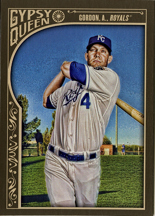
Bad photo, check. Blurry edges on obviously photoshopped player, check. Pixelated sky? Sure. Why not. If you’re going to make a terrible card, you might as well go all out. Alex Gordon was not standing on that field, he’s been cut out, poorly I might add, and placed on it. Not only that, but the effect looks to have been applied to him and the background separately. There’s no excuse for that sky. That’s just processed poorly. Look at these others…
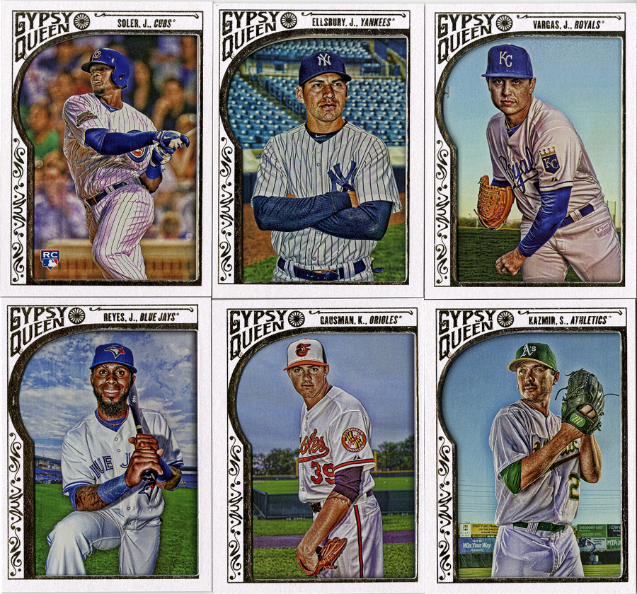
Ignore the other 2, but Gausman, Kazmire and Vargas are all standing in front of a very similar sky. All of these were probably taken in Florida during spring training. They’ve all been processed to an acceptable level. Even Reyes, with more complicated clouds behind him, managed to come out with heavy distortion.
It’s such a shame that a good concept like this is diminished by sub-par design work. I’m sure the folks in Topps graphics department work hard. They’re probably on really crappy deadlines and they probably have to do so many of these that they start to not care. I get that. I’ve been there. I also know that I don’t produce something that will be seen and handled by thousands of collectors, who view cards as mini, collectable, pieces of art. Art that represents both the players and the sport that they enjoy.
That’s something that’s worth taking the time to do a little quality control with.
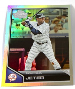
by Matt | May 26, 2015 | Cards, Personal, Tech
We all scan cards, right? I’m always quick to the scanner with stuff like Gyspy Queen, Ginter, and anything without gloss. I hate the way Chrome cards scan. I either scan them and spend 20 minutes in Photoshop trying to get them to look normal again, or I don’t scan them at all.
I’m sick and tired of “it looks way better in person” and “this card didn’t really scan well”. It doesn’t have to be this way. I’m a photographer, I can do better than this. Why am I scanning cards I know won’t scan well?
No more!
I’m still working out the details, but after putting together a quick, 10-minute, proof-of-concept, I’m already convinced that a light tent is a better way to go. They’ve been available forever in the photography world, and I’ve had several over the years. They’re not super durable, and they don’t last long, but they’re handy for quick table-top photoshoots. I’ve shot jewelry, I’ve shot glass, I’ve shot nick-knacks and antiques. Quite honestly, I’m embarrassed I hadn’t thought of doing it with baseball cards.
But, doesn’t that take longer? Good question. It really depends on the setup. I made a quick light-tent out of a cardboard box and a couple 8×10 sheets of thin paper. It’s small enough to leave on my desk, ready to go. I have a long (30ft) usb cable and I’m shooting directly into Adobe Lightroom. I created a quick import/hot-folder action to automatically rotate the photos and apply color correction. If I can standardized my cropping (and automate that as well), then I’ll have finished images as fast as I can shoot them.
I can do more at one time on the scanner, 20+ cards per scan. I can do entire team sets. I also have to pull the files into Photoshop and color correct, resize, and crop anyway. So, it’s actually about the same.
It’s the “right tool for the job” type of thing. For sets of cards, or cards with matte finishes, the scanner works best. For single, ultra-glossy refractors, a photo is definitely the way to go.
I’m going to invest again in a more professional set up, but these images are my tests. These are made with a small cardboard box, some white paper, and two old Canon flashes, nothing more. I did not use my “good macro lens”, or my “good lights”. Just imagine if I had. Look at the way the sparkles/highlights/colors pop on these.
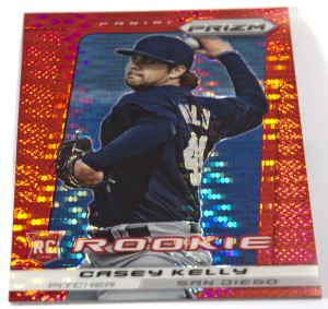
I need to make a “stand” to prop them up so that it eliminates the shadow, but I think we can all agree these look better than muddy scanned versions we all normally get. This will be a fun little experiment. I wonder how small I can make a light box? If I can make something “card sized” I can pretty much leave it on my work desk indefinitely. Back to the drawing board for a final version, but I’m liking the direction it’s going.
by Matt | May 24, 2015 | Cards, Red Sox
When I saw the initial “preview” of Diamond Kings a couple months ago I thought I could safely ignore it as a product I didn’t really have any interest in. Then I saw the checklist. Then I saw it in person. Now I’m all in. I love these cards. They are awesome. Panini has done an exceptional job with these.
 (more…)


Recent Comments