2019 Topps Heritage Breakdown

2019 Topps Heritage Breakdown

Cards

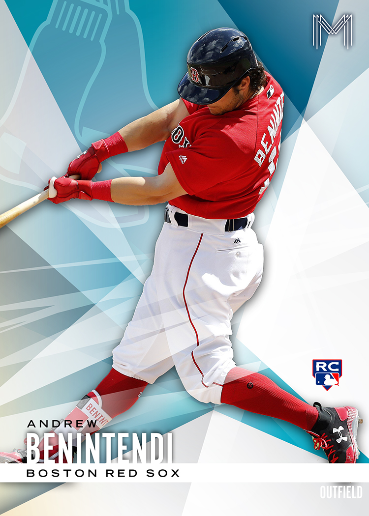
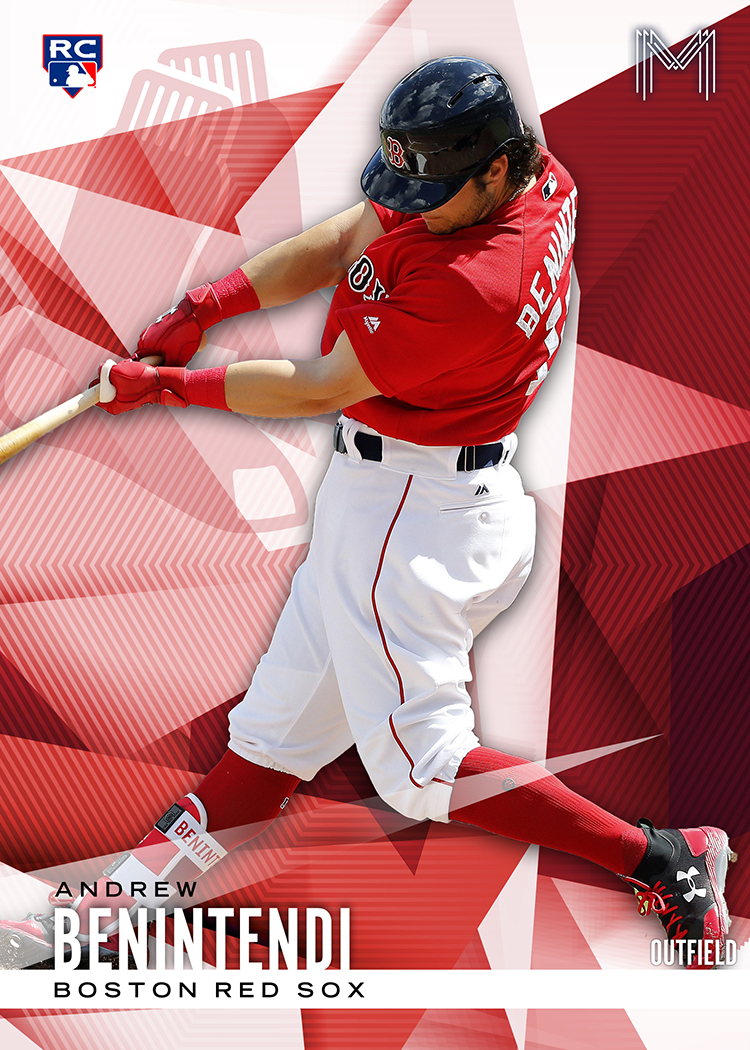
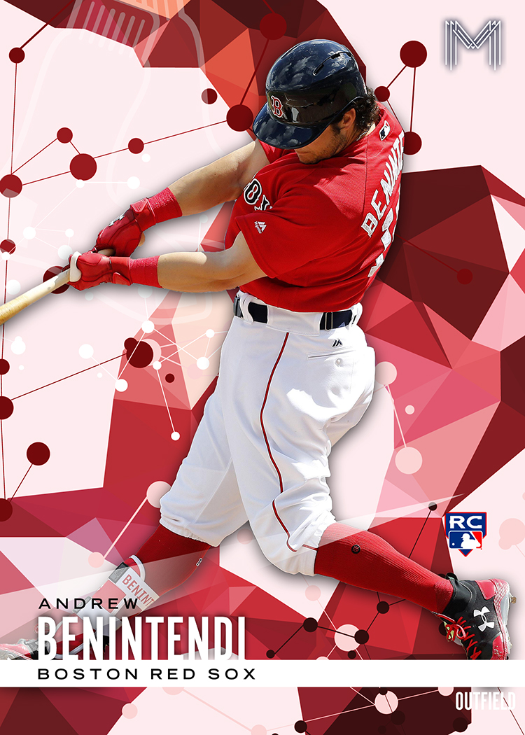
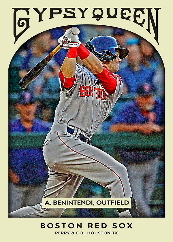
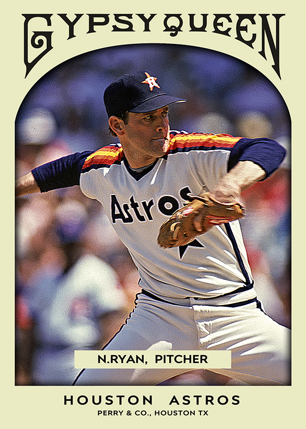
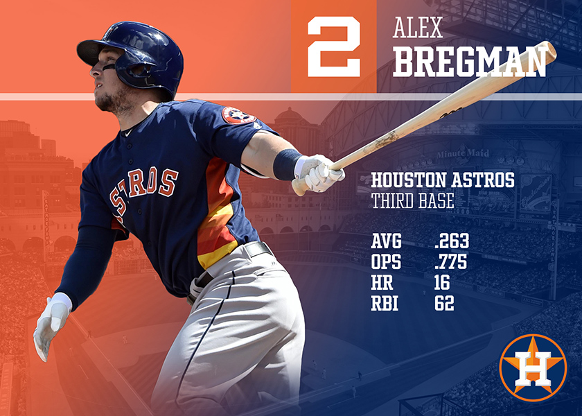
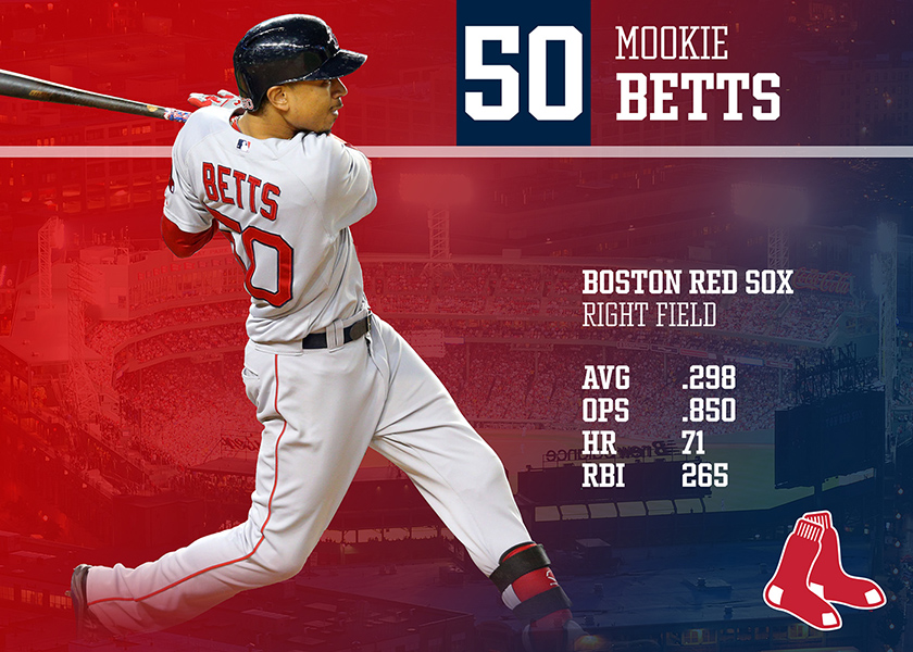
2019 Heritage – Design Breakdown

Grey is very in this year…

Matt “Doc” Perry

March 5th, 2019

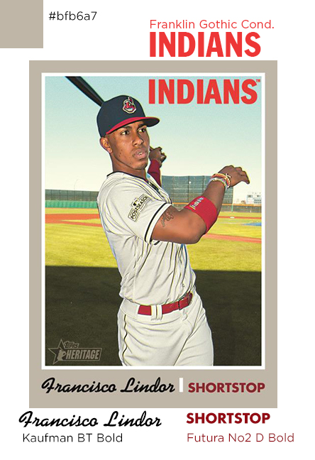
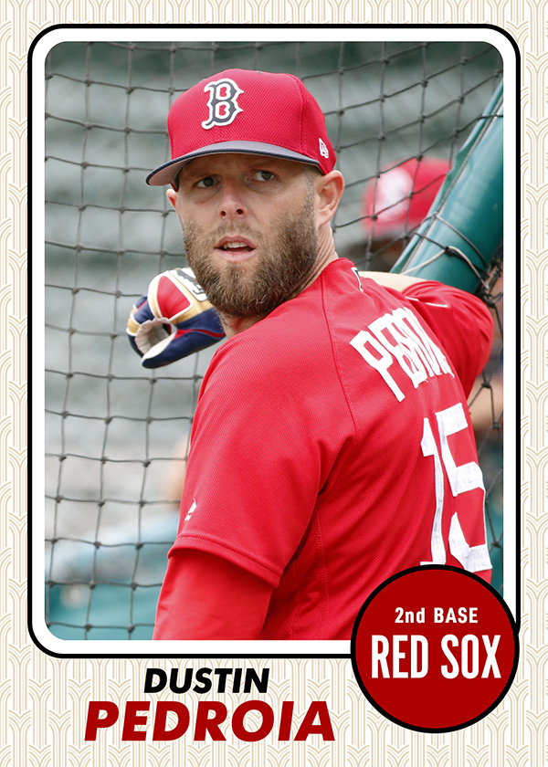
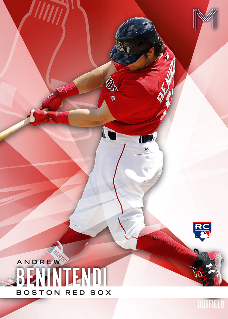
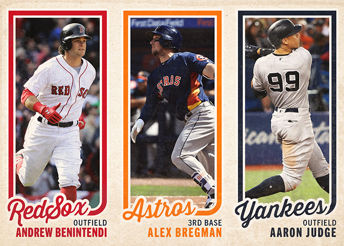
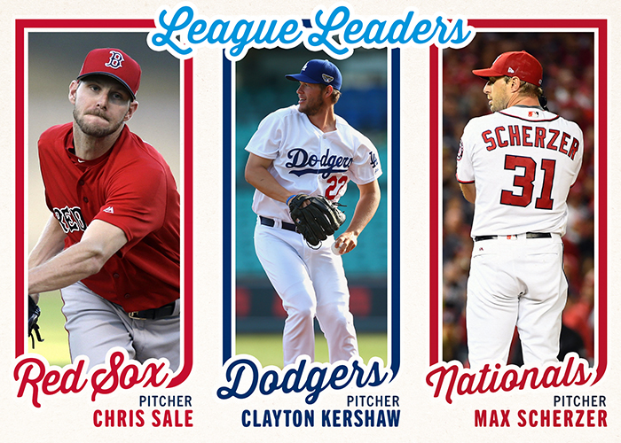
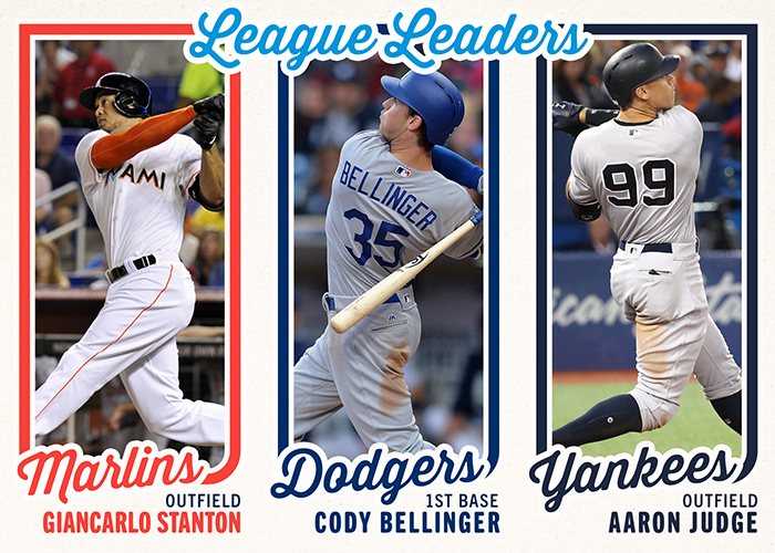
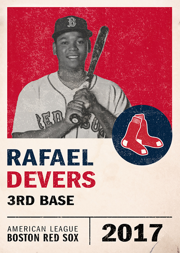
It’s not going to come as much surprise that this breakdown took all of 20 minutes. 1970’s Topps isn’t exactly known for it’s intricate design. I mean, a grey box doesn’t really need to be “broken down”. That said, I figured I’d at least take a look at the fonts and try and nail those down. At least that way I can share with those of you who like making your own customs, and I can have them in my back pocket for doing a “Heritage-esque” card later on.

So, what are we dealing with? For starters, two classic fonts with long lineages and one more whimsical one for the names.

Up top, for the team names, you’ve got the always classic Franklin Gothic, with what I’m thinking is the Condensed variation.

At the bottom, for the player position, a version of Futura called No.2 D, and the Bold version at that.

The name was slightly trickier, but I’m 98% confident it’s Kaufman BT Bold. It could also be “Cafe Script”, they’re very similar, but I’m sticking with Kaufman.

After that, it’s really just boxes, grey, and a nice photo. The grey looks to be #BFB6A7, at least in my monitor’s color profile.

That’s really all there is to this one. A nice simple design that we can build on for something truly custom down the road.

So, I had an idea…

So, I had an idea…

Cards

So, I had an idea…

What if I could automate a gallery?

Matt “Doc” Perry, Somewhere on that 3rd rock from the Sun

February 15th, 2019

I love solving problems (even non-existent first world ones) with technology.

I had taken a look at the woefully out of date pages on my site the other day. I hadn’t update a needs/wants list since 2015, I hadn’t updated a trade-bait cards list since 2012. It was pretty sad. What’s the old saying? “The cobblers children have no shoes”? Well, the web guy doesn’t have time to update his own site. I’ve built 4 sites in two months so far in 2019, but I can’t seem to find the time to update a list.

So, I had a thought. What would be the easiest way to have something, essentially, update itself with minimal interaction and effort? What if I could create a gallery of Trade-worthy cards using a few off-the-shelf plugins and scripts?

Well, I gave it a try.

cards.docholoday.com

Edit: I actually updated my Cards page after I liked the results… Click Here.

I need to say up front that this is a TEST of the technology, not a full blown implementation.

Here’s the jist. On the server, within a defined “gallery” folder, I’ve created 30 sub folders. One for each Major League Baseball team. In those, I drop scans of cards. I’ve made the scans with a photoshop action that crops, resizes and saves anything I have in my “marquee” tool. I have the tool set on a fixed size (2.5×3.5). I scan an entire scanner bed of cards, click once on the card, click the action button, and done. Saving with a useful name is about the longest part of it. Then I use an FTP program to just drop them into the 30 folders.

That’s it. No editing pages to update galleries, no painful WordPress short codes to change. Heck, theres not even “pages” technically.

So, with this little experiment, I took a handful of cards I had sitting around (not and exhaustive inventory of everything I have) and tried it out. It seems to work pretty well.

More cards load as you scroll on the “all” category. It’s sortable by teams if you have a specific interest. The images open larger in a lightbox.

And I feel like all I did was drop files into a folder.

Again, this was just a test. A theory. Since it seems to be working, I have a feeling I’ll be porting it back to this site and integrating it here. Until then, please check it out and let me know what you think. I can answer any questions about it as well for those of you that have WordPress blogs as well.

Later.

2019 Topps Series 1

2019 Topps Series 1

Cards

2019 Topps Series 1

This checklist is a raging dumpster fire.

Matt “Doc” Perry, Somewhere on that 3rd rock from the Sun

February 13th, 2019

I should say upfront, there’s nothing really “wrong” with Topps flagship this year.

The design is fine, it’s simple enough, although I did notice a few things here and there that kind of bugged me. There’s room for nice photos, the horizontal variations are good, they’re not overly and obviously photoshopped and processed. My main complaint this year is the checklist. I feel like it’s complete and utter garbage. I also feel like the Red Sox and Yankees and Braves (oddly) are given undue amounts of focus and inserts. It might seem weird that I’m complaining about too many Red Sox cards, but yeah, that’s where we’re at with this set. I can’t speak for other team collectors so I’m only speaking for Red Sox fans here, but look at this garbage…

3 Eduardo Nunez – WS HL
13 David Price
23 J.D. Martinez – LL
28 Boston’s Boys
50 Mookie Betts
54 Rick Porcello
76 J.D. Martinez – WS HL
77 J.D. Martinez
160 Fenway Park
167 Xander Bogaerts
179 Jackie Bradley Jr.
228 Rafael Devers
262 Mitch Moreland
275 Steve Pearce – WS HL
312 Mookie Betts – LL
314 David Price – WS HL

There’s the “base” checklist. J.D. Martinez 3 times. Mookie Betts 3 times (if you could the “Boston Boys” insert). David Price twice. A throwaway “Fenway Park” card. Let’s cut that down to just players…

Eduardo Nunez, David Price, J.D. Martinez, Mookie Betts, Rick Porcello, Xander Bogaerts, Jackie Bradley, Rafael Devers, Mitch Moreland, and Steve Pearce.

That’s 10. Not 17. 7 extra cards with little to no purpose. “But wait, those are celebration cards for the World Series!” you cry. Are they? Are they really? They sure look a lot like base cards with a logo slapped on it. J.D. Martinez’s card for instance, has him batting, pre-swing. His World Series card? Dropping the bat post-swing and a WS logo in the corner.

The base cards aren’t even really my problem. I’m ok with 10-17 of them. I would have liked fewer repeats, but I’d be willing to live with it if it weren’t for the damn inserts in this cluster of a product.

  • There are SEVEN (of the 10) base cards with SP photo variations.
  • There are NINETEEN “150 Years of Baseball” inserts
  • There are SIX “1984” cards, because we haven’t beaten that to death yet?
  • There are FIVE “Grapefruit League” inserts, because no one remembers Ted Williams so we’ll remind you he played in the minors?
  • There are FIVE “Greatness Returns” inserts, because inserts.
  • There are FIVE completely pointless “Iconic Card Reprints”, because why try something new when we can put in reprints?
  • There are SIX “Stars of the Game” inserts.

THAT’S 70 CARDS!!!!!

I haven’t even counted parallels, relics, autographs or manufactured crap. Seventy freaking base and insert cards is nuts. Completely bonkers.

You know who I feel bad for? The Yankees. (I hope I never have to type that sentence ever again). They have, and I’m not exagerating, ONE HUNDRED AND THIRTEEN cards that I would consider a base or insert card. Holy crap. There are 37 Gleyber Torres cards alone, mostly due to a special insert set just for him.

At this point, I have to honestly wonder what the product managers at Topps were thinking. Were they lacking material and didn’t want to make a “small” set so they over compensated? Were they inspired by the “150 Years” anniversary and got carried away? Were they trying to make the product more interesting because it’s always a weak seller and people usually wait for Series 2/Update to spend more on chasing rookies?

I have no answers for any of that, except to say that I’m personally not falling for it this year. This will the first year in my 8 years back in the hobby that I will refuse to collect a master team set. I’ve got my 17 base cards, which I’m fine with, and if anyone wants to dump pointless inserts at me, I’d take them, but I’m not going to go out of my way to find, pay for or collect any of the additional 50+ cards.

I just can’t get behind this idea that they needed to over saturate the product with cards no one will ever card about. Do we want minor league cards of people that have retired and/or died? Babe Ruth, according to Baseball Reference (https://www.baseball-reference.com/register/player.fcgi?id=ruth–002geo) was on, but never played a game for, two “International League” teams in 1914. By all accounts, he went strait to Boston in 1914 and played 5 games. So, for Topps, that means he should get a “Grapefruit League Greats” card? For a league that didn’t technically exist? He was in Baltimore and Providence RI. That’s not exactly south Florida!

I just don’t think this product was well thought out. Normally I’m super excited about the return of baseball, the start of spring training, etc, but I found myself staring at the boxes in Target over the weekend and I just couldn’t buy any of it. I had read the checklist ahead of time. There’s not a single other card (rookie or star player) from the larger set that I would want. I suppose I’m just not going to buy any this year, which is a shame, because my love for baseball is stronger than ever. With the retail exclusives continuing to be a problem and checklists like these, I can see this being a very lean year for my card buying.

Again, I don’t have a problem with the design, I think it’s fine. It’s certainly better than a few of the previous years, last year especially.

I actually took a swing at the design (for customs) and it was fairly strait forward. I’ll do a breakdown of the layout and the fonts at some point. Until then, these are probably the only Series 1 scans I’ll be making…

Blog Bat Around: All Autograph Team

Blog Bat Around: All Autograph Team

Cards
Blog Bat Around: All Autograph Team
Bro, do you even autograph?
Matt “Doc” Perry, Creative Idiot, Texas
April 23rd, 2018
All autograph team?
That was the challenge, thrown out there by Torren’ Up Cards, and batted around by the other card bloggers. Pick out the best cards in your collection, and try and put together a team by position.

Normally, I only dabble in autographs, and usually only if their names end with “Holt”, but I thought I might have enough autos from other solid position players to give it a try. I learned two things really quickly. First, I have considerably too many pitching prospects autos. Second, I don’t have anyone at second. I don’t actually have a Pedroia auto (way out of my price range), and the only other Red Sox second baseman worth considering, Bobby Doerr, has past away and I don’t have one of his autos either. That leaves other teams and I had to go searching through the trade bait. Sadly, I don’t have an over-abundance of random second basemen auto’s either. That leaves Brock Holt, as a utility man… aaannndddd the circle is complete. lol.

Also, I’ve seen only a handful of pitchers posted, and that’s just not fair. You’ve got to have an entire rotation, at least in my opinion, as well as a bullpen. Also, DH. Deal with it.

Here we go!

Starting Pitchers
Rick Porcello
Tim Wakefield
Luis Tiant
Clay Buchholz
Jon Lester
Steven Wright
Infield
C – Jason Varitek
1B – Mike Napoli
2B – Brock Holt
3B – Kevin Youkilis
SS – Nomar Garciaparra
DH – David Ortiz
Outfield
Andrew Benintendi
Fred Lynn
Shane Victorino
Bullpen
LRP – Brian Johnson
Setup RP – Andrew Miller
Closer – Koji Uehara
Random Bench Players (just to show off more cards)

Card Show 2018

Card Show 2018

CARDS

Houston Card Show 2018

I’ll take all the Benny’s please!

Matt “Doc” Perry, Creative Idiot, Texas

March 15th, 2018

So, I mentioned a couple weeks ago that Sam and I had made plans to go to the Houston Tristar Collectors Show. I scanned everything after we got back, but life got busy, and I hadn’t made a post about what I came home with. There’s nothing truly earth shattering in terms of the cardboard, but I had a great time hanging out with Sam, we don’t get to do that too often. Speaking of, let’s start with the only non-Red Sox cards I picked up. I don’t claim to actively collect Astros cards, but I certainly don’t avoid them either. I’ve always felt it’s good to have a couple rookies cards for obviously talented players. Absolutely nothing wrong with picking up a Bregman and a Correa.

There on the right as two Singleton RCs, Bowman Platinum and Bowman Chrome. Then last years Bowman Platinum for Bregman and an early Panini Prizm Draft Pick card for Correa.

Manny

Let’s just jump right in here and get started. I’m always pleasantly surprised (because I can pick them up for cheap) with how little love Manny Ramirez gets at card shows. People will literally give away cards. I get it, he used drugs, I don’t care. He’s never getting into the Hall, and I’m ok with that. I also enjoyed watching him destroy baseballs. I always mention, every time I make a post like this, that if he hadn’t used PEDs, he still would have been one of the greatest contact hitters ever. He would have had considerably less power, but we’d be including him in every “greatest of all time” discussions about OPS and RBIs. Fun fact, he has 8 less RBIs than Ted Williams. 19th all time. Manny was fun as hell to watch.

Three cards I wanted to point out. First, two rookies that I had never picked up the parallels of. I already had both the ’92 Draft Picks and the iconic ’92 Bowman, however, I had never run across the Topps Gold “winner” variation of the draft picks or the gold foil parallel of the Bowman. Both are awesome additions to my collection. Lastly, that “blue square” card in the upper right corner of the previous photo, that was a Stadium Club “Passport to the Majors” relic, and #1115/1200.

Ortiz

In case it wasn’t obvious, I scanned most of the cards in sections, just to make life easier. There’s a couple of the better card, scanned individually, towards the end, including a nice Ortiz. These were a few random ones that were scattered among the dime boxes.

I couldn’t remember which Heritage inserts I had or needed, so I grabbed both. The Bowman Chrome is a refractor. The three in the middle were ones I just didn’t recognize as having in my Ortiz player collection.

The Bat Kings relic from last years Donruss, at the bottom, was a nice pickup for a dollar.

Sale & Swihart

Couple rookie cards for Chris Sale and Blake Swihart. Cards shows are really awesome for find those $3-5 cards on ebay, for $0.25. Every seller at a card show is trying to move inventory, and half the tables are things like “3 for $1” or “15 for $10”, or some crazy combination like that. The more “base” a card, the more likely it’ll be in a quarter or dime box too. I don’t remember what sort of box these came out of, but let’s just say they didn’t exactly break the bank.

The Sale “Bowman 1st” card is one of those I don’t remember seeing on eBay for less than a dollar, so that was a solid pick-up. I only had one Sale RC previously, and it was from (*cringe*) Lineage. These are a bit more recognized as important rookie cards, and we can’t forget my undying love for Bowman Platinum. These two will fit nicely into my collection.

The Swiharts were nice pick-ups as well. I had the base version of the “1st Bowman”, and found this nice black border. The more recent Bowman (2016 I think) was actually a “gray” parallel, which I sort of forgot they did. I didn’t remember having one of those, so it made it’s way into my stack of cards as well.

Youuuuuuuuuuk

I’m actually pretty proud of digging these two out of someones incredibly dirty dollar box. It was one of those really nasty, obviously been in storage, yellow’ed top-loaders, sorts of boxes. I had to pull them out of the top loaders to make sure they were ok looking, even though I’m not a “condition sensitive” sort of guy, and put them in fresh top loaders as soon as I got home. Both the rookie cards have been on my “Top 10 to find” list for at least a couple years now. Really really thrilled to knock those off the list.

Steven Wright

Apparently I’m going all-in on a Steve Wright collection, whether conscientiously or not. All three of these were at my favorite table at the show, the “$2 relic/auto” guy. He’s been there the past couple shows and has box after box of cheap hits. He’s also busted what must have been a dozen cases of Team USA products because the boxes are loaded with huge Team USA patches and autos. I didn’t have my “what prospect was drafted by what team” list with me, so I concentrated on Sox rather than prospects. All three of these beauties knocked off autos I had been looking for for Wright. I’m especially happy with the /25 Ginter mini. Love those.

Bobby Doerr & Dustin Pedroia

Not a ton to say about picking up cards of a legend. I mean, there’s only so many cards like this that can be made. I love the old linen swatches. I like the design of the SP Legendary cuts a bit more than the Tribute, the first couple years of Tribute were kinda rough, but both are really solid cards.

As for Peddy, there wasn’t much I could find this time around. Not that there’s anything wrong with a blue chrome refractor, I just wasn’t finding much else this year.

Brian Johnson

Brian Johnson is an interesting one. He looks to have finally put the pieces together to make a full-time stand in the majors, but he has, by all accounts, the worse possible luck with injuries, line drives to the face, missed opportunities, etc. I’d love to see him do well, which is why I haven’t given up picking up cards of him. I think he still has a lot of potential, unlike a few other prospects that Topps keeps pushing cards of (looking at you Henry Ownes).

Rafael Devers

Just picking up more Devers cards in what everyone is hoping will be a huge breakout season for him. A nice chrome version of the Prospects card (from Donruss), this time from Optic. A simple Bowman, and a nice Bowman’s Best that I didn’t have. There’s going to be a ton of RCs to chase for him this year, but I’ve got most of the pre-rookies already taken care of.

David Price

Ok, I’m going to admit it, I’m not a huge David Price fan. I don’t like the way he handles his business. If you come in and pitch like an Ace, like Sale did, than you can be a huge jerk if you want. Hell, Clemens was the biggest jerk on the planet but everyone let him be one because the guy was winning Cy Young awards. Price needs to have a ridiculously dominant year to earn back a little street cred. That said, I love those Diamond Kings relics, and Immaculate is always a nice brand. I wasn’t crazy about Gallery this year, but the numbered Press Proof is nice too. Good cards for a pitcher I’m not a huge fan of. I would love to take those words back.

Nomar

Out of all my player collections, Garciaparra’s is probably the biggest. I’ve lost track of what’s in it. I organized it by year at some point in an order to get it under control, but I still just pick up any Nomar card I come across. I’m 98% sure I have that Lords of the Diamond from Topps Chrome. I don’t really care. I like it. I probably liked it the 1st, 3rd and 9th times I bought it. The SP Authentic is a Sheer Dominance gold, which I’m pretty sure is a new addition to the collection. The Fleer Tradition was just for fun but also new, and that “Invincible 2000” is, of course, some crazy card from Pacific. It’s “card” on the walls on the front, but blue plastic/acetate in the middle. It’s nuts.

The second picture I actually combined two scans into one: closed, and open. That Fleer Genuine Insider is one of the most unique cards I think I’ve ever seen. The relic part pulls out from the main card. It’s hidden “inside” the card until you pull it out. It sadly has a big chip it in by the pull tab, but I don’t really mind. It’s just a neat idea, low numbered, and I’m happy to add it to the collection.

Bogaerts

Found a couple nice Xander Bogaerts cards at this show. A purple Bowman parallel from 2017, a couple Rookie and Pre-Rookie Bowman Platinum cards, and a regular Bowman RC, which I already had but I’m more than happy to have another copy of. The real nice acquisitions were the 2016 Prime Cuts relic and the “Special Event” relic. I love Prime Cuts in almost any of it’s incarnations, but ’15 and ’16 appeal extensively to my retro inclinations. Being #/149 is just a nice touch. The other card, 23/25, and all sorts of shiny (the scan doesn’t do it justice), is either from Black Friday/Cyber Monday or from the National Card Show. I’m not sure which, but I really like it.

Prospects

It goes without saying that prospects are the main component to dime boxes. People rip case after case of stuff like Bowman and Bowman Chrome and pull out those ultra-hot rookies they’re looking for, and dump the rest, which is great for me since I’m looking to pick up prospects on the cheap.

At the top there’s a trio of Austin Rei cards, who’s one of the better prospects left in the Sox farm system. Bowman Chrome 1st card and two colored parallels (purple and black) from I think 2016 Bowman Chrome. On the bottom, a purple Kyle Hart, a blue Margot and a blue paper Shawaryn.

The middle row has a bit of a mystery. I thought I had bought two of the same Sam Travis cards, and at first glance they’re identical… except, around the Bowman Chrome logo in the corner. One has a “7”? What the heck? The one WITHOUT the 7 is numbered 004/150. The other isn’t numbered. They are both the same back, same card number (BCP170) and both have the same card code at the bottom (CMP023936). They are both the same color, same pictures, same backs. If they’re both blue chrome parallels, I don’t know why one is numbered and the other isn’t. Anyone have any clue?

Edit: Figured it out! Bowman Chrome lists prospect variations as follows… Refractor #/499, Bowman 70th Logo Blue, Purple Shimmer (Hobby), Purple #/250, Blue #/150, Blue Shimmer #/150, Green #/99, Green Shimmer #/99, etc, etc, etc…

So, I’ve got a 70th Anniversary Blue (un-numbered) and a Blue /150. Neat!

Benintendi

Gathering up Benintendi cards, even duplicates, was an actual goal I had going into the show. I have at least one copy of his rookie cards from most major products through my purchases of team sets last year, but getting a second (or third+) was something I was looking to do. That and find any that I might have missed.

Along the top we have a fairly hard to find insert from Bowman Chrome two years ago, the Bowman Scouts Top 100. Then a yellow paper parallel of last years Bowman. Finally a Bowman Chrome “Fantasy Impact”, blue parallel, #/150.

The middle has a couple additional copies of cards I already had, but they’ll go nicely into the newly formed player binder.

At the bottom, three cards from Panini’s college card offerings. Two EExE and a 2015 Contenders for the University of Arkansas.

Here’s a couple more Benny’s. The Finest at the top confuses me, since there’s another (different photo) card for him in Finest, so I picked this one up hoping it’s a photo variation. The Chrome Freshman Flash insert was a new addition, and the 1st Bowman was just nice to have another copy of.

Along the bottom, that purple Bowman’s best is 213/150 and a really nice addition, I didn’t have it or it’s base version. The mojo refractor in the middle is from Series 1 this year, and the other Bowman’s Best is confusing given it’s lack of RC logo.

All really nice pickups if I do say so.

The rest…

Here’s the rest of the cards I felt were scan worth. Lots of awesome stuff from this show, and couple I’m really happy to have in my collection.

A 2013 Topps Sterling #/99 Red Parallel auto for Jon Denney. A 2014 Topps Chrome Mini Gold Parallel #25/25 for Wendell Rijo. And finally, an Emerald Green Bowman Platinum Mauricio Dubon #07/99. Yeah, I realize Rijo and Dubon were traded, but those were really nice cards and I couldn’t pass them up.

Next up, a really nice 2017 Topps Mini Orange parallel of David Ortiz, #23/25. After that, a 2017 Museum Collection patch for Rick Procello, #30/50. And finally, a 2014 Bowman Platinum Matt Barnes Team USA auto-relic, #/740. The irony of barely being able to hit a sticker with a pen on the Barnes card is not lost on me.

Two awesome Immaculate Relics up next. The Porcello actually came from Sam, who handed it to me as we were walking in to the show. My first card of the day. Sam always finds the coolest stuff. The Mookie came from the previously mentioned “cheap relics” guy for $2. Not going to pass that up. Both from 2017 Immaculate and both #/99.

Now we’re cooking. Two awesome cards for two different reasons. First a black bordered mini from 2006 Ginter. Not only did I not collect when Ginter started, but the minis are a pain to even try and find. Finding a black bordered Ted Williams, for next to nothing, was awesome. Beside that, a really neat yellow printing plate for Sam Travis, 1/1 obviously, from 2017 Panini Absolute. Beautiful plate.

Last but not least, two exciting prospect autos for two talents who are actually still in the Red Sox system, and who haven’t been sold off by “Dealin’ Dave” in the front office, yet.

A 2014 Elite Extra Edition Josh Ockimey Auto, #/799, isn’t ultra rare, but while the talk surrounding the young prospect took a dip last year, he reportedly has the tools to bring it all around and be a considerably big league talent some day. Time will tell.

The same could be said about the next card too. 2017 Leaf Valiant Tanner Houck, orange parallel auto, #11/25. Just being /25 was enough to convince me to pick it up for just a few dollars. Any of the other colored Leaf cards are sitting on eBay for $30+. First round draft pick, top 100 prospect, all good things.

Well, that’s it for card show scans. I had a blast going with my good friend and picking up some really nice cards. It was a Saturday very well spent.

Thanks for reading!

More Customs

More Customs

This wasn’t actually the post I planned on making today. I had a great time with Sam at the card show in Houston this past weekend and had planned on post some of the cards I picked up. They’re scanned, but they’ll take a while to crop and whatnot. Instead, I’ve got something else up my sleeve. I realized I had been showing off random custom cards on Twitter more than I had here, which was a huge oversight on my part. I had made web sized previews of everything, but had never posted them. So… you ready for this? Nearly every custom card I’ve made since LAST APRIL. There’s even a couple previews of works-in-progress that I haven’t gotten around to finishing. Let me know what you think, and which ones are your favorites.

2017 Heritage Re-work

Let’s start off easy. This one is a rework of 2017 Topps Heritage. There’s nothing really wrong with the 1968 design layout wise, but there were two things that bothered me about both ’68 and it’s Heritage re-hashing. The colors of the circles, and the background texture. It never made any sense to me why the circle colors had nothing to do with the team colors. If I remember correctly, the Red Sox in that set were on bright pink/magenta. The other problem the circles always seem to have were off-centered printing. The text almost never landed in the middle of the circle. Lastly, the “burlap” pattern might have been fine in 1968, but it’s ugly as heck today. So, while I kept the basic idea, I fixed the colors to correct team colors, centered the text, and replaced the background with a retro art deco pattern rather than the texture.

Also, I followed in Topp’s footsteps. There’s regular and “short printed” photo variations, and a SSP variation I made just for Sam.

Topps Finest-ish

Next up, Finest. Sort of. I wanted something to try out some reflective material I had found. Finest, having been originally known for it’s refractors, is now all about the crazy variations and patterns. I tried out a couple different combinations (digitally) as well as actually printed on various materials. Had fun with this one.

1980 Topps Basketball

I don’t collect basketball cards, but I am aware of several iconic ones. The most iconic card, to me, is probably this one. A 1980 Topps basketball card with Larry Bird, Dr. J and Magic (technically it’s an RC for both Bird and Magic). The font is funky, a throw back to the 70’s, the colors make no sense, and the weirdest part is that it’s perforated, so you could pull it apart into 3 mini cards. That’s just crazy. I like crazy, so I turned it into a baseball card instead. Team appropriate colors, a rookie card, and then a couple takes on “league leaders”. Also did a “dirty” version, in case it’s been sitting in a shoebox in the basement all this time.

Immaculate

One of the things I try to do a lot is to recreate stuff that’s out of my price range. I’d never open a box of Immaculate, or National Treasures, or 5-Star. I just don’t have that kind of money. So, I try to make some instead. This is a take on Panini Immaculate. I ended up actually printing these and replacing the colored bands with foil. I was pretty happy with the results.

Impeccable

This is pretty much the same idea as Immaculate, only with a different product. These were inspired by Panini Impeccable, which I think is a football and racing product. I thought it could use a baseball version, and I just love playing around with ink/splatter brushes.

Rookie of the Year

These were a take on Panini Contenders Football, and an insert set within it. I believe it was something along the lines of “Ticket to the Show” or “Draft Ticket”, emphasizing up and coming rookies. Baseball isn’t quite so immediate with their draft results, having players go through the minors, but I liked the idea of the ticket stubs anyway. So, “Rookie of the Year: Contenders” was what I came up with. Someone kinda ran away with that award, but let’s pretend there were other candidates. Truly, I should have made a couple more after the playoffs were over, but this was back in July/August.

Street Cred

This one just came out of boredom one day. I had gone down to see an Astros game mid-June and there’s a whole area next to Minute Maid park with some above average graffiti. I thought it might be cool to see some actual baseball graffiti, and here we go.

Renaissance

Was trying a different painting action and this just kind of happened during the playoffs. I was pretty down at that point with the hurricane and everything, and was just messing around in Photoshop to blow off some creative steam. Might go back and rework these later, not 100% happy with the results, but it’s a good start to something.

Gypsy Queens

My love of all things Gypsy Queen is well documented. It should be no surprise to anyone that I made some customs. I’m still forever in love with the original, and the 2011 original remakes. The arch, the old-timey yellow. One of my favorite sets of all time.

1956

I love the idea of vintage cards, but it’s just not my jam. I can appreciate the designs, and the history, just not the price tag and that constant and endless search for cards in better condition. That said, I wanted to take on the classic 1956 design. I liked the double photos/paintings of players and the bright colors. These were just kind of an experiment, but turned out pretty neat in the end. Finding the right photos was really a struggle on these. Decided to use team appropriate colors as well.

Stadium Stats

The inspiration for these came directly from Minute Maid park and their graphics department. The scoreboard in center field features graphics very similar to this for each player as they come up to bat. I thought it might make a neat looking card and made some tweaks. The stadiums in the background for example, and obviously a simplified stat line.

Box Loaders / Cabinet Cards

So, here’s a weird one. When Allen & Ginter came out last year I really liked the look of the purple/retro box loaders they came with. Trouble was, the photos they used were studio shots of the players superimposed into vintage studio scenes. I had neither of those to work with, so they kind of mutated into something else. Added a pattern background, awkward name plates, etc. Then did a 180 and decided to make them more painterly. Kind of a weird, retro mashup. They look ok, especially the Bregman, the yellow really pops, but I’d probably redo them if given the chance.

Then and Now

I did a take on Heritage’s “Then and Now” in my first custom post last year with Ted and Mookie, but I went really retro with it. These were inspired by 2011-13 Heritage, which I thought did a better job than 2015-17 with that particular insert set. Just an FYI, the fonts are accurate to the originals in these (and most of the others as well). If anyone wants to know what a specific font was, just let me know.

Black Gold

These are the most recent customs I did. I did these back in January when the blogosphere was going bonkers over the 90’s originals. I started off with a fairly accurate recreation, then spun it into it’s own updated version. I couldn’t match the “Topps BlackGold” repeating endlessly in the background of the originals, but let’s just assume I didn’t feel like writing “Topps” over and over again into a pattern. The updated version are more “gold as in texture” (tops and bottoms) but keeps the “halo” around the player and team-less name plate as a tie-backs to the original.

Rated Rookies

Around the time Donruss came out last year, I was having a real hard time finding some. I really liked the retro look and I think Panini did everything right with 2017 Donruss, especially the Rated Rookies. I love them. These aren’t really different from the real ones, with a few minor tweaks here and there. This was just a strait up “re-creation” card. I did add some gradients to the background stripes, but that was just for the heck of it. This was another card I wanted to make to test out printing materials. These look awesome in real life on superrefractor material.

One-offs

Some times I was just trying out an idea. Some times maybe I just wanted to do one card instead of a bunch. Here’s a couple random cards that didn’t really go with a group. There’s a “1914” inspired Devers where I was experimenting with the layout and fonts. There’s a 2012 Elite style Diamond Kings (before DK was a brand again), there’s a take on 2017 Ginter that I wasn’t really crazy about (not the custom, Ginter in general) and a Topps Star Wars Autos inspired “Galaxy” card.

Works in Progress

Lastly, some stuff I’ve been working on that I never got around to finishing. There’s two “modern” cards, sort of a take on “Tek meets Finest”. There’s also a “Fire” inspired, super abstract with retro flare sort of thing with Correa (mostly because the orange and blue really pops). Lastly, I probably don’t need to even say the name, but I’m working on my take on the infamous Perez-Steele cards.

So, there we have it. Phew, that was a ton of stuff. Sorry for the insanely long post. I hope you guys like these, I certainly enjoyed making them. Thanks to the folks on twitter for providing input on some of these, it’s always appreciated.

Thanks for reading!