2019 High Heat – AL EAST

2019 High Heat – AL EAST

Customs | Cards | Baseball

2019 High Heat

American League East

Matt “Doc” Perry, Texas

June 20th, 2019

So, a couple posts back I had mentioned how I was putting together a custom set of cards this year, a major undertaking given the general lack of time I seem to have for creative projects these days. It was something I wanted to do, not for some blogging statistical goal, or to sell to people, or to show off, but to be able to flex the creative muscles a little bit and do something I actually enjoyed doing for a change.

I’ve been making head-way with the set and I’m about half done. I decided to do a 100 card set. That seemed like an obtainable goal. 300-700 was just going to be out of the question. With 30 teams, I can do 3 per team, and add 5 Rookies from each league, giving me an even 100.

I looked at the team statistics from Baseball Reference and the MLB.com stats pages and tried to pick what I thought were the most interesting and engaging players. Players who are having really good years (up to this point) and performing well could have gotten preference over the more established names you’d normally see on cards. For the rookies, I took a look at Baseball America’s list of most likely “Rookie of the Year” candidates. I also came up with my own variation of an “RC Logo” to distinguish them from the rest.

So, without further ado, let’s kick off the set with a look at the AL East!
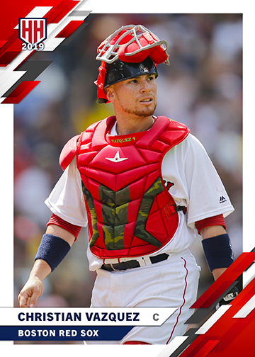
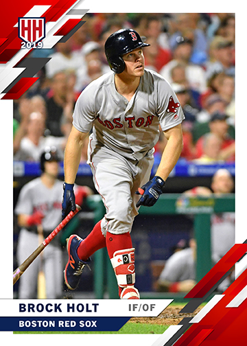
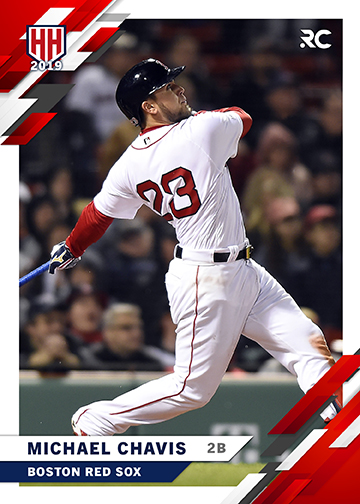
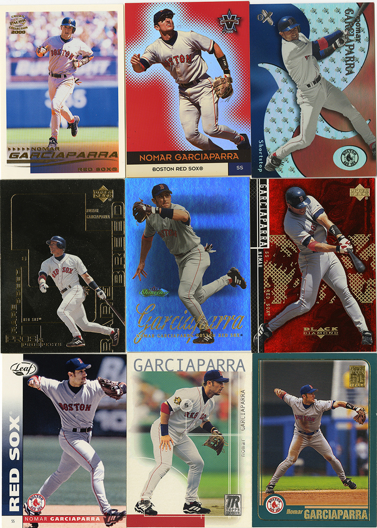
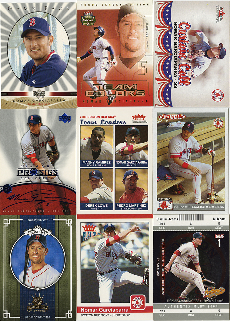
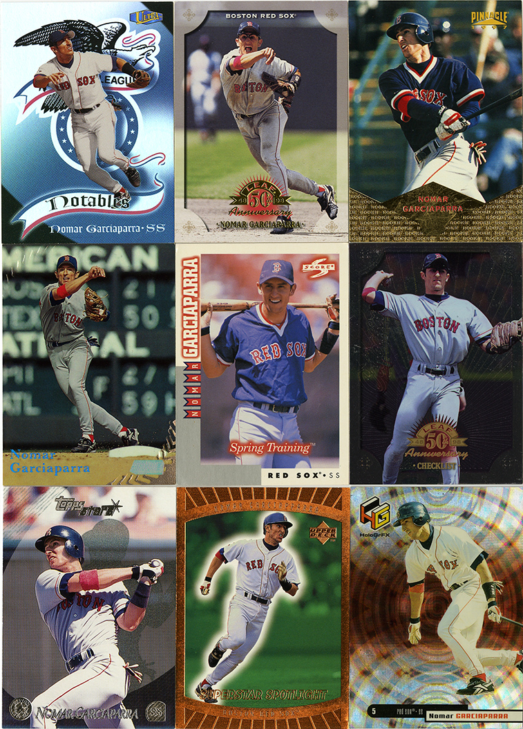
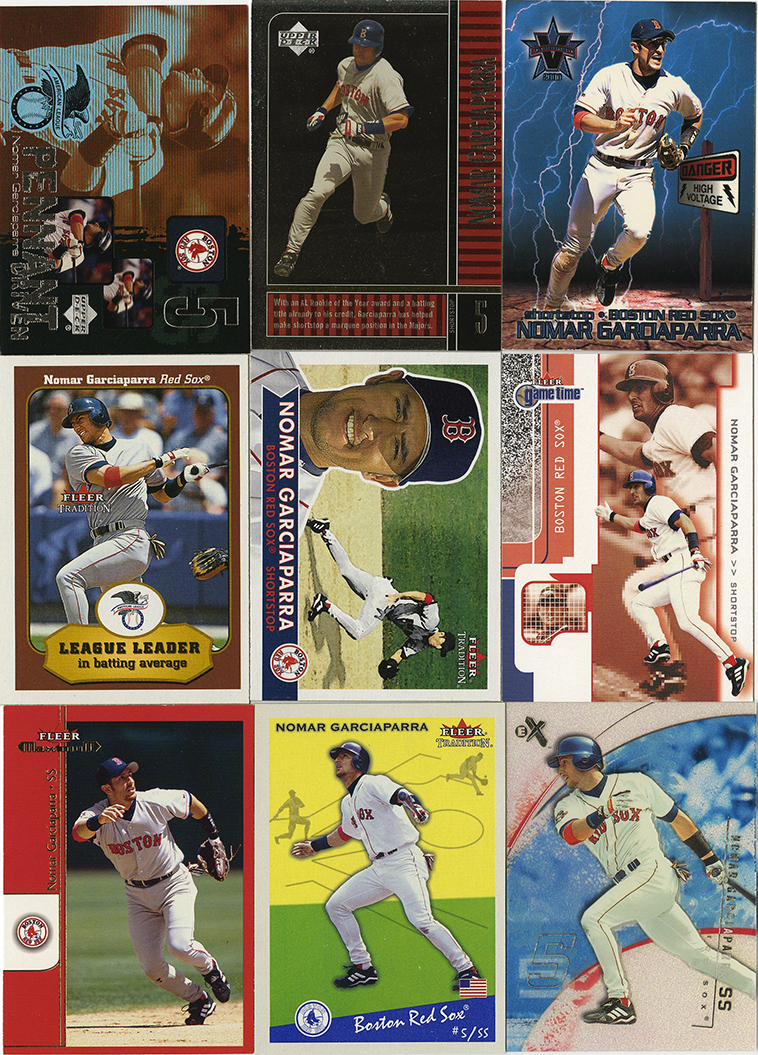
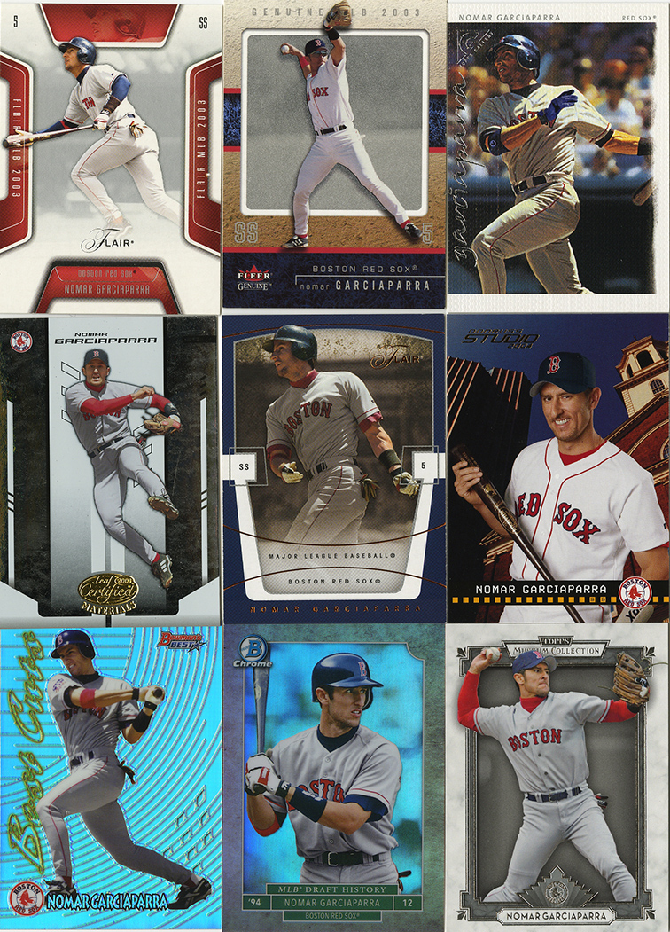
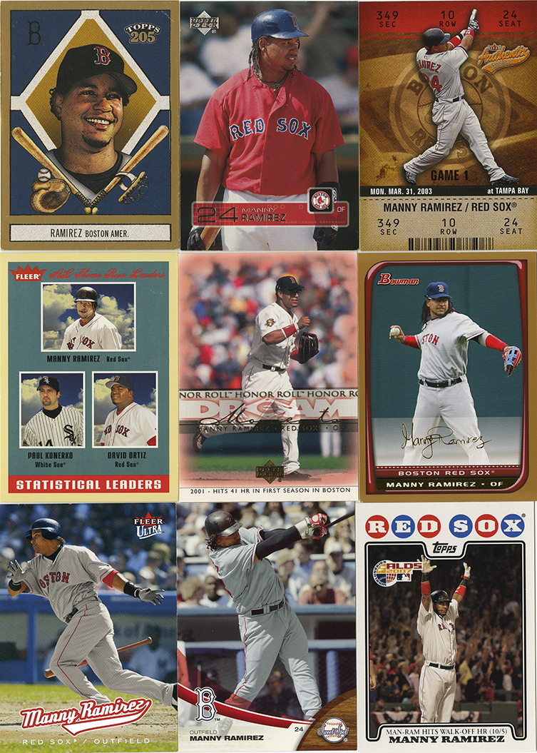
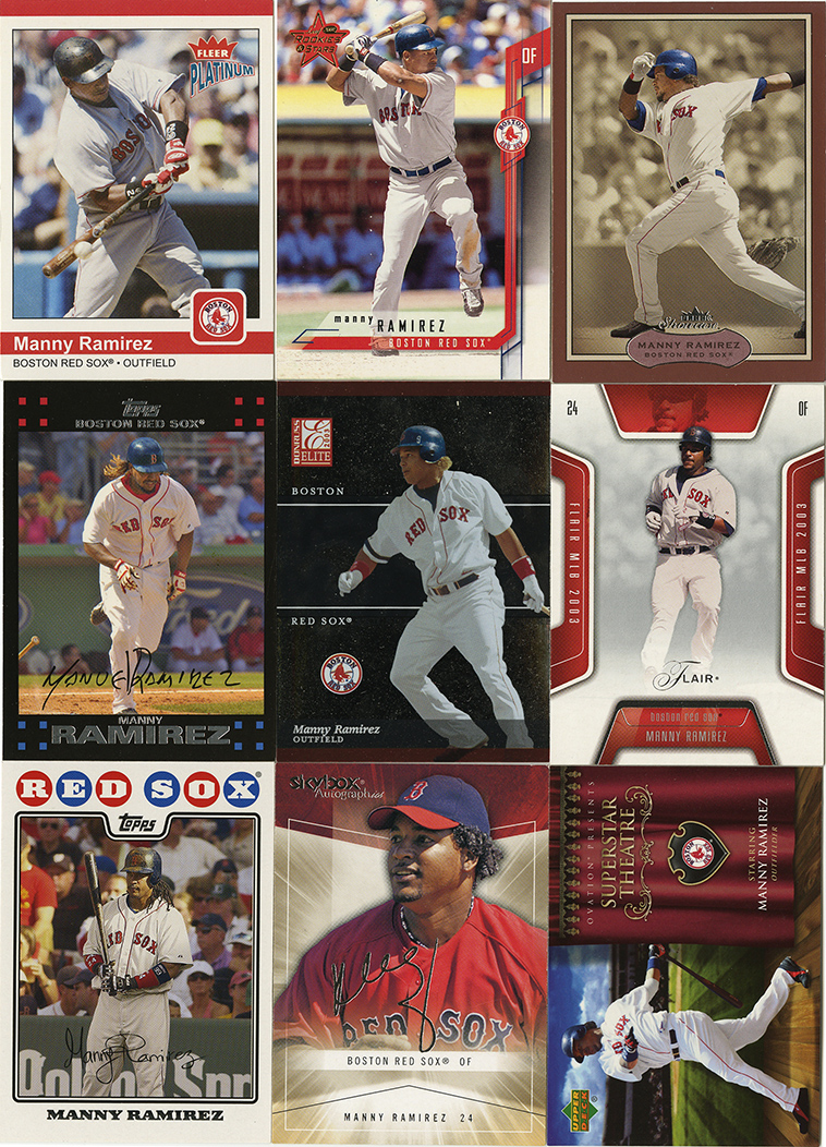
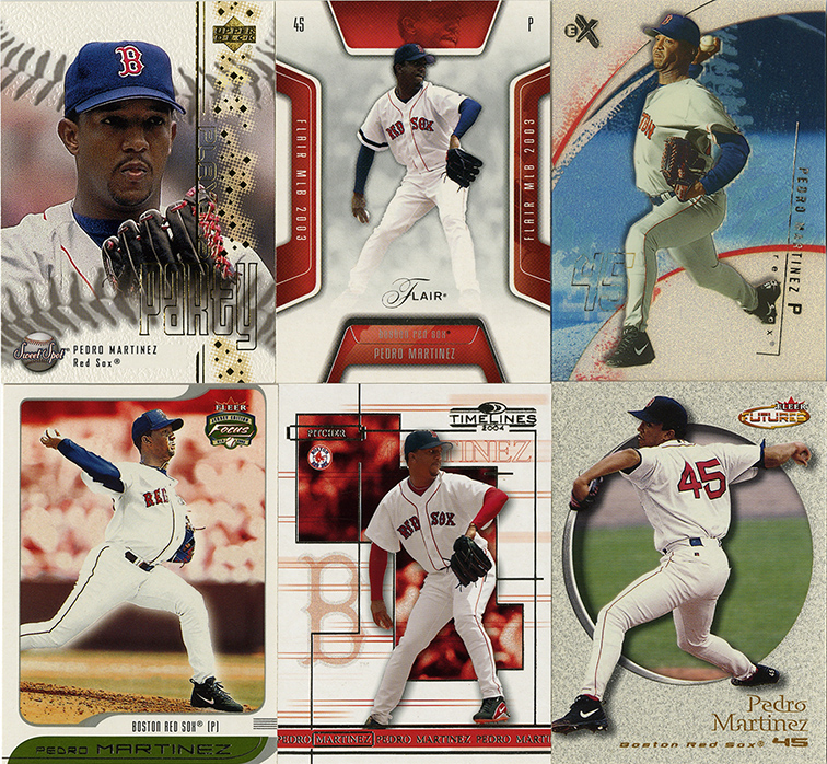
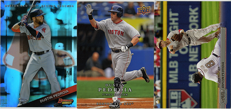
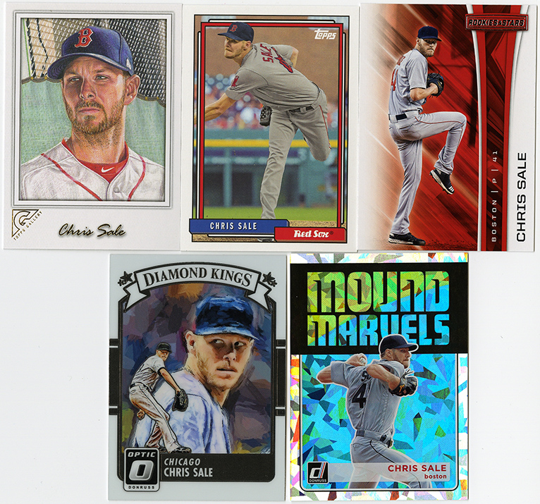
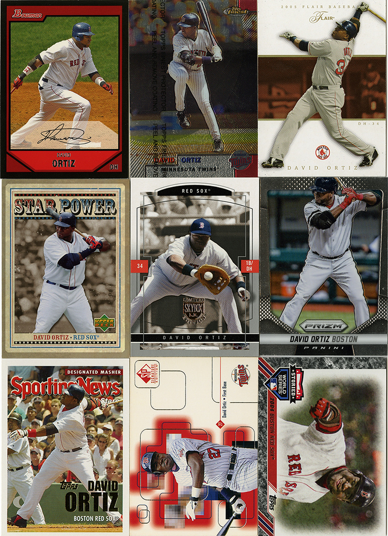
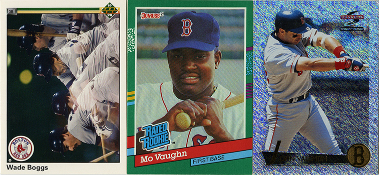
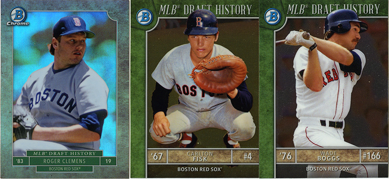
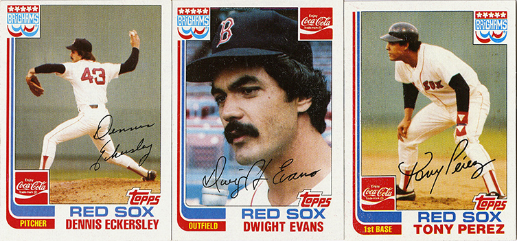
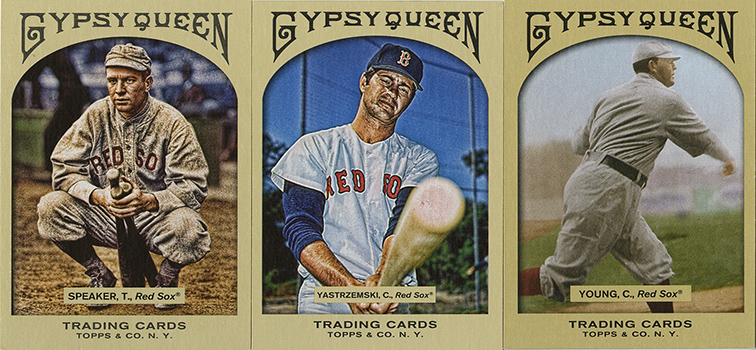
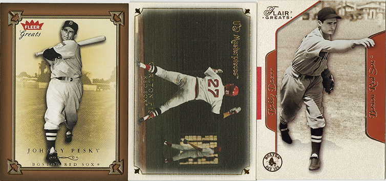
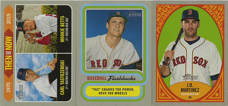
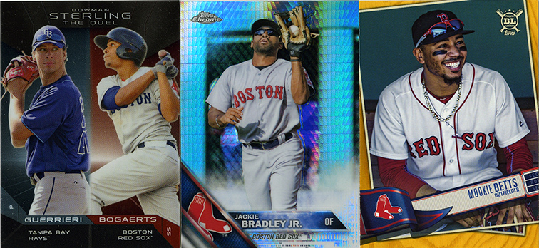
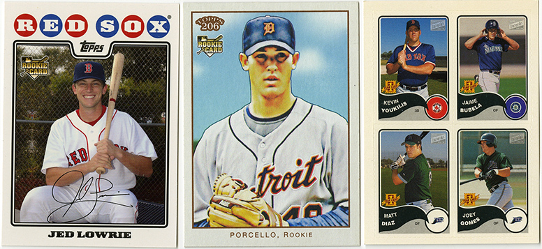
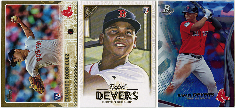
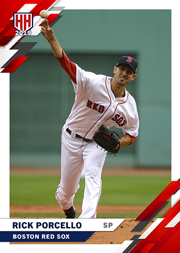
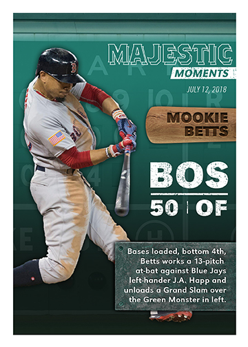
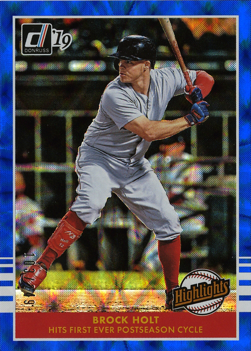
Red Sox

I’m going to save the “complete” Red Sox cards for the very end of this series of posts, because I wanted to do an entire 25-man team set for myself. So, instead of those, we’re starting with a cut and paste of some of the Red Sox cards I already previewed in the previous post, because a) they were already done, and b) it’s easy in my WordPress builder plugin to clone sections of content. New to these previews however is the Michael Chavis RC. He’s had a pretty solid rookie season and can certainly hit for power.
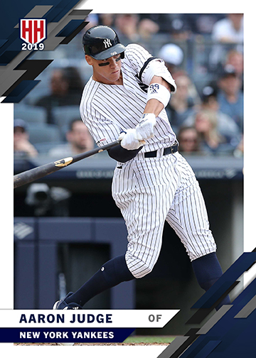
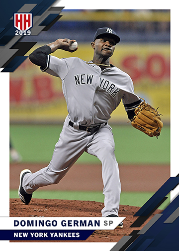
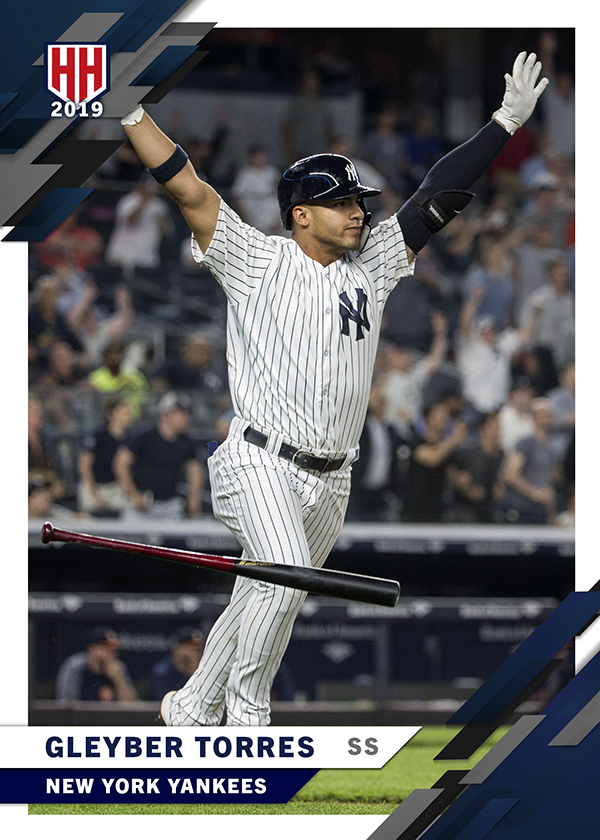
New York Yankees

Next up, our storied rivals, the New York Yankees, who are putting together a frighteningly good season already, and that’s with half the team on the DL. The playoff race in the second half is going to get really interesting.
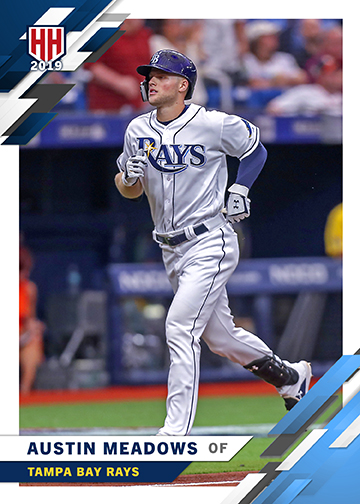
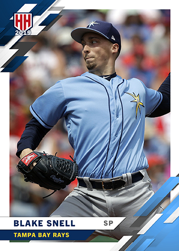
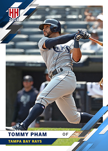
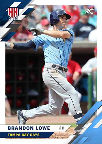
Tampa Bay Rays

I’m not going to lie, the Rays have been a real surprise this year. With a couple hot rookies and the pitching being surprisingly good they’re going to easily be in the race for a playoff spot. Brandon Lowe gets the 2nd AL Rookie Card treatment in our list.
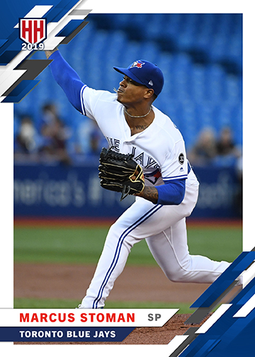
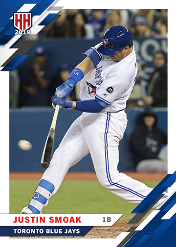
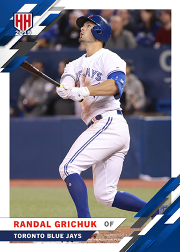
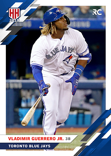
Toronto Blue Jays

Despite having one of the most highly anticipated rookies on the team, the Blue Jays are racing against Baltimore to see just how many games they can lose this year. There have been a few flashes of life here and there, but it certainly seems like the Jays are in for a mediocre season at best.
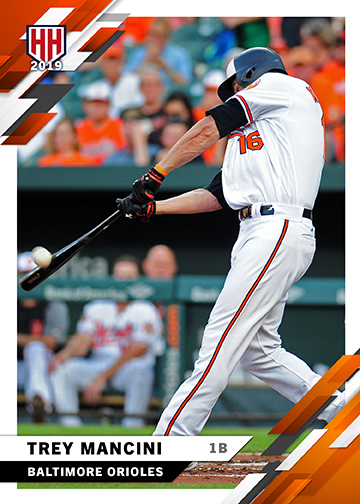
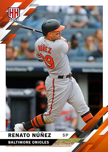
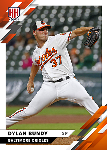
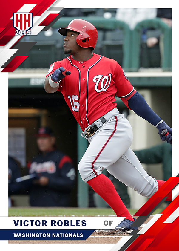
Baltimore Orioles

Last but not… well, actually, no. Just last. Last up are the Baltimore Orioles. With Machado gone I can now honestly say I hate them less, but it’s still pretty fresh, so that wound will take a while to heal. It’s a race to the bottom in Baltimore. The only team, historically, worse than the 2019 Orioles? The 2018 Orioles. Ouch. These three seem to be playing well at least, so they get cards.

There we go, there’s the AL East. Well, at least in completely fictional cardboard anyway. I’ll be posting the rest of the divisions over the next couple weeks. If there’s any suggestions or requests for specific players on specific teams, let me know and I’ll see what I can do.

Thanks for checking them out!

Card Show 2019

Card Show 2019

CARDS

Houston Card Show 2019

Twenty bucks and a box of Nomars.

Matt “Doc” Perry, Cardboardaholic.

June 18th, 2019

For once the Annual Tristar Show in Houston wasn’t on Father’s Day weekend, it was the week before. I don’t usually like to go on Father’s Day itself since it’s seems blatantly selfish to spend the entire day looking at small rectangles of cardboard and not spending time with the family that I love (aka: being a good father). So when I read that it was the week before I did a little mental back-flip because I knew I would get the chance to go. My expectations have been lowering themselves a little bit each year with less and less vendors offering the kind of cards I’m looking for and less and less baseball in general. The number of “high-end” and football/basketball related vendors seemed to have doubled this year and so my lowered expectations were easily met.

Let’s put it this way. I ran out of things to look at loooong before I ran out of time or patience to actually look at them. I spent the majority of my time at two tables. That sadly didn’t include the “$2 Relic Guy” who vanished last year and hasn’t come back.

I did find two guys with dime boxes, and that’s where our story begins…

Nomar

The vast majority, probably 50% or so, of the cards I found this year came from one dealer, and one box. He had actually taken the time to ALPHABETIZE his dime box. Let that just sink in for a minute. Yeah….

So, when I was going through it there was quite literally a whole row of Nomar Garciaparra cards. I just grabbed the whole damn stack. It was roughly 55-60 Nomar Cards that I thought I didn’t have. After sorting them at home I found a few duplicates, but being able to add multiple pages to my Nomar binder for next to nothing made the whole trip to the show worthwhile.

I tried to scan them chronologically, but then realized I was making “pages of 9” but in doubles across the scanner, so it’s a little messed up. The older stuff is, in general, at the top (first two scans) and the newer stuff, ending with modern inserts, are towards the bottom. A couple cards are worth mentioning specifically. Things like the ’97 Upper Deck Echelon and the ’97 Pinacle with the gold foil I had just simply never seen before. There’s also a chrome version of a Leaf 50th anniversary card, which I’m led to believe are harder to find parallels. The Topps Stars and Topps Reserve are little known brands that had escaped my radar. The Victory 2000 and eX cards are just the right level of crazy and (although I’ve said it before) the Authentix Tickets and the old school Topps Gallery are some of my favorite products in general.

Manny

The same vendor who had the Garciaparra cards also had a healthy stack of Manny Ramirez cards. That made me happy. I don’t have nearly the same level of player collection going for Manny, but it’s getting close.

Pedro and Pedroia

Same vendor, same box for the Pedro cards. I can’t remember where the Pedroia’s came from, but I’m thinking it was the other vendor.

The second vendor had piles of monster boxes just layered on top of each other. No signs, no organization, and the cards were a complete mishmash of everything. I found the 2017 Stadium Club in the same box that I found a ’91 Mo Vaughn RC in (below). It was a mess, but it was actually fun to look through. Every time I thought I’d give up and move on I’d find another card or two that was neat. Didn’t hurt that the guy was just looking to get rid of stuff. Assuming it was a dime box, I had about $10 worth in my hand and asked what the price was. The guy said “$2 and it’s yours”. Done and done… and then I went back and looked through some more boxes, digging for more gold.

Sale and Ortiz

The same story repeats itself for most everything else you’ll see in this post. Two or three vendors, random boxes. No huge purchases, but just a fun time digging through boxes of stuff nobody else wanted. I did really enjoy peeling the protector off the Ortiz Finest though. It was very satisfying. (maniacal laugh!)

They come in 3’s

The rest of these I’m scanning in 3’s, just to make life easier. Let’s start old-school…

A ’91 Upper Deck “multiple exposure” Wade Boggs, one of my favorite cards from a photography perspective. A ’91 Donruss Mo Vaughn RC that I never got as a kid, checking that off the bucket list. And a ’95 Score Summit John Valatine… I mean, just look at that thing, it’s insane.

Recent Bowman Chrome inserts… for some reason. Bowman doesn’t need throwback inserts, it just doesn’t. These were a “well, at least I know I don’t have them” purchase.

Ok, here’s one that completely blew my mind. 1982 Topps, but with Brigham’s Restaurant / Coke branding. For those that don’t know, Brigham’s was a restaurant and ice cream parlor chain in New England. I grew up going to Brighams. They sold the restaurant business to some crappy chain restaurant company and those went under, but they sold the ice cream to Hood, another New England institution that’s still alive and well. This was like finding a piece of my childhood. The crazy part is that these were at the card show in HOUSTON! I don’t know how else to explain it, but these cards were meant for me to find. After some searching I’ve learned that there are 22 in the set. They will be mine!!!

Speaking of things that will be mine. I’ve decided I was stupid to break up the set of 2011 Gypsy Queen that I had, and that I really need to finish a complete set. A second Red Sox team set certainly couldn’t hurt either, so I grabbed these at some point throughout the day.

These are great. Literally and figuratively. I love Fleer Greats, I love Flair Greats, and UD Masterpieces are easily top 5 in my favorite sets of all time list.

I have the basic team set this year for Heritage, including the World Series cards, but I never picked up the couple inserts there were. I think I’m still missing one or two (Mookie NewAge?), but these certainly helped.

Last one’s before we get to the slightly above average stuff. A couple parallels for my favorites B’s. Betts, Bradley and Bogaerts. I actually might have had all but the gold Betts, and “Big League” wasn’t something I was really interested in, but always good to find some cards for the player collections.

Rookies

I had a few of these, but a couple are new. Never hurts to pick up a couple rookies for your current players, especially when they’re really cheap.

Two Benny’s and a Bradley.

Here’s a couple I don’t think I actually had. The Jed Lowrie just kind of looked lonely in the box. I never finished 2010, so I figured I’d grab it in case I needed it. I don’t think I have any Porcello rookies at all. I wasn’t a huge fan of t206, there are certainly better retro products, but I’ll take it from an RC perspective. The tiny stickers, after some research, appear to be 2003 Heritage Bazooka stickers. Most importantly, they have a Kevin Youkilis “1st Card” sticker, which I believe completes my Youk RC collection.

Next, an ERod gold version of his RC, which I think is new to my collection, a Devers Gallery parallel that I didn’t have, and a Devers Bowman Platinum that doen’t have an RC logo on it because it’s 2017 and he’s still listed as a prospect.

The stuff that’s worth more than a dime…

There were only a couple cards I spent more than I dime on. I felt like these were worth the $0.25-1 (seriously) they were asking for them.

2010 Bowman Chrome “1st Card” for J.D. Martinez. Yeah, it has a scratch on it, but I didn’t have one and I’m not a huge “condition” collector that’s going to worry about it. If I find a nicer version to upgrade later that’s great, but I’m just happy to finally have one.

2011 Topps RC for J.D. Martinez. I really like this card, just in general. It goes great with the Altuve and Trout in my case. I can only imagine what a set box of 2011 update goes for these days… (looks on ebay)… holy crap. $6000. I feel like I did good with this for $1.

Last but not least, a 2010 Bowman Chrome “1st Card” Chris Sale purple refractor. I feel like Sale rookies don’t get enough attention, and I’m just glad to snap these up before he does something insane like throws a perfect game in the World Series and is a first ballet HOF’er.

Well, that’s it for card show scans. I don’t think I really went crazy this year, was just enjoying “the hunt” for neat cards and didn’t really have any goals for going. I brought $100 with me, parking was $15, and I left with $60, so I think I did pretty good for $25 on cards.

Thanks for reading!

2019 High Heat Series 1

2019 High Heat Series 1

Customs | Cards | Baseball

2019 High Heat

Inspired by Donruss, made by ME!

Matt “Doc” Perry, Texas

May 1st, 2019

Let me get this out of the way right up front. I like Donruss this year. Yup, I said it. I’m a fan. It’s not a perfect set, most sets rarely are, and it has a few things I felt inspired to tweak, but the majority of it is just fine the way it is.

So, what exactly are these cards? These cards are a first draft at fixing some issues with Donurss and being inspired to create a set of my own. The original plan was to do an entire 30 teams x 25 player-rosters master set. That might be a little over-ambitious for a first set attempt. It’s more than likely going to be a 100-player set with at least 3 players from every team. Lots of people do sets of customs and I’ve decided it’s high time I try my own.

What exactly is High Heat? High Heat is a custom set, and brand, made by me. If I ever do any print runs, or send out cards to people, it’ll be under that moniker. High Heat Studios is mine. There’s nothing to see there at the moment, but that’ll change at some point and there will be copious amounts of custom cards there.

Card Design

My two main problems with Donruss involved the corners and the retro parallels. For starters, along the top of the Donruss set there’s an odd “cutout” that makes the white border seem extra large along the top edge. It just didn’t really seem necessary if the design was essentially “diagonal lines” in general. Also, the bottom right corner was just a mess. In a grey corners, barely visible, they crammed parts of a city name (depending on the length), the player’s position, the player’s number, as well as an abbreviated city/state again, plus a semi opaque Donruss logo. Huh? Meanwhile, under the players name was a completely wasted horizontal space of color.

The second issue I had with Donruss was the retro rookies. There are 50 rookies, in addition to the “rated rookies” that have a 1985 parallel design with black borders. I can understand doing something different with the rookies, but to have two seperate rookie pools, with different designs, is just weird. Plus the black borders (and to be clear, I’m a fan of black borders in general) just look out of place in a set where every other card has a white border.

So, what did I do about it?

The top-left corner now mirrors the bottom right in style, even though the individual “pieces” are different. There are a few grey and white pieces but the primary colored pieces now match the team colors accurately. The team name is now on a separate “banner” underneath the player name, and the position is now obvious and to the right of the names (whereas before it was obscured in the corner). The secondary team name banner now matches the teams “other” color as well. I tried to make them acurate to the teams official colors (provided I could find them on their websites or inside brand/press packets). The white border is now uniform around the entire card. The fonts are accurate to the originals, and I have the luxury of not having a printing deadline, so the players are represented on the teams they were on on Opening Day 2019, not last November when a checklist was created.

Also, because variety is fun, some of the teams with more interesting color palettes have “alternate” colors for the secondary team banner. For example, the Phillies have the “light blue” as opposed to merely white and red. This helps separate a team like the Phillies from a team like the Cardinals or Angels.

Red Sox

I’m going to start with the Red Sox since it’s where I start with every custom card I make. Normally I try and get the design where I like it for them, and then create a “master template” to work from for the rest of the teams. Here’s a few Sox cards to start off 2019 High Heat Series 1.

Everyone else…

And now for some of the others. I had a blast coming up with these, trying to find good photos to use, researching the colors, etc. Like I said at the top, I’m planning on doing 3-4 cards per team for a full set. Time will tell if I can find a printer to make a huge sheet of these for me for a reasonable price. For the time being, enjoy these, and let me know who absolutely needs to be included for your favorite team.

I’ll be doing more throughout the year, hopefully a set’s worth by the end of the summer. Stay tuned, more to come!!!

2019 Donruss Highlights

2019 Donruss Highlights

Cards

2019 Donruss Brock Holt Highlights

Who knew awesome came in so many colors?

Matt “Doc” Perry

April 24th, 2019

So, 2019 is off to a bit of a whimper for the Red Sox, and card collecting is more or less following suite. There’s not a ton of excitement in the first few products this year. The rookie class is weaker, the designers are weaker, and there are enough short prints and random variations to choke a goat with. Even my stalwart Gypsy Queens are rather underwhelming this year.

Donruss however has been my one bright spot so far. They’re simple, they’re not expensive, and the collation is so good that in TWO blasters and a couple random packs I have about 85% of the base set. You can’t really beat that. I’m also in the minority of collectors since the lack of team names and logos doesn’t bother me in the least.

The Red Sox are well covered in the set, with a couple photo variations here and there, but also with a few well deserved inserts as well. This brings me to just one of two Brock Holt cards to make an appearance in 2019. The other being Heritage. The trouble with Heritage is that the parallels are so short printed, the easiest to find ones (chrome) are starting at $15 on the secondary market. No thanks. I’m not paying $40+ for a semi-rare Heritage variation. Not happening.

Instead I’ve decided to chase the Donruss rainbow. Holt has an insert card celebrating his post-season cycle game. There’s several variations with a couple being un-numbered and actually harder to find than their color/numbered counterparts.

The checklists includes: Base (Silver) #/999, Diamond, Pink Firework, Rapture, Vector, Bronze #/349, Blue #/249, Red #/149, Gold #/99, Green #/25, Black 1/1.

The Diamond, Rapture and Vector parallels are the hardest to find at the moment, with most believing they’ve been short-printed in favor of the colored parallels, or only available in certain packages (retail hanger packs, for example).

That only leaves me with a couple more to go. I’m still looking for “Diamond” (a more geometric version of the base silver pattern) and “Rapture” (a small, sparkly diagonal line version) as well as Gold and Green. I have a Gold saved in the eBay app at $20, but I’m just waiting for the price to drop a little. I haven’t seen a Green appear in the wild at all.

A fun little parallel rainbow is always a good chase, at least for me. 

Anyone else enjoying Donuss, or is everyone still not liking the lack of logos?

2019 Topps Heritage Breakdown

2019 Topps Heritage Breakdown

Cards

2019 Heritage – Design Breakdown

Grey is very in this year…

Matt “Doc” Perry

March 5th, 2019

It’s not going to come as much surprise that this breakdown took all of 20 minutes. 1970’s Topps isn’t exactly known for it’s intricate design. I mean, a grey box doesn’t really need to be “broken down”. That said, I figured I’d at least take a look at the fonts and try and nail those down. At least that way I can share with those of you who like making your own customs, and I can have them in my back pocket for doing a “Heritage-esque” card later on.

So, what are we dealing with? For starters, two classic fonts with long lineages and one more whimsical one for the names.

Up top, for the team names, you’ve got the always classic Franklin Gothic, with what I’m thinking is the Condensed variation.

At the bottom, for the player position, a version of Futura called No.2 D, and the Bold version at that.

The name was slightly trickier, but I’m 98% confident it’s Kaufman BT Bold. It could also be “Cafe Script”, they’re very similar, but I’m sticking with Kaufman.

After that, it’s really just boxes, grey, and a nice photo. The grey looks to be #BFB6A7, at least in my monitor’s color profile.

That’s really all there is to this one. A nice simple design that we can build on for something truly custom down the road.