I should start this off by saying the easier way to do this is to take a scan of a card and simply cut out the “corner” design elements and paste them onto a photo. If you’re more inclined to do that, I’d recommend reading the first part of the tutorial and ignoring the later 2/3rds. However, if you’d like to know how to recreate the 2016 Topps design, vaguely accurately, read on.
Prerequisites: In order to complete this tutorial you’re going to need a few things…
- Basic to moderate Photoshop knowledge.
- Photoshop CS6 or CC (for the lens blur effects and stacking layer styles)
- Several “grunge” and/or “water color” Photoshop brushes. Some free examples here, here and here.
- Various metal textures and patterns, examples here.
- A “metal hole” texture or pattern, good example here.
- Team logo of your choice (good resolution)
- A high-res photo of your favorite baseball player. Try Google, image search, “more options”, “larger than 4mb”.
Let’s do this!
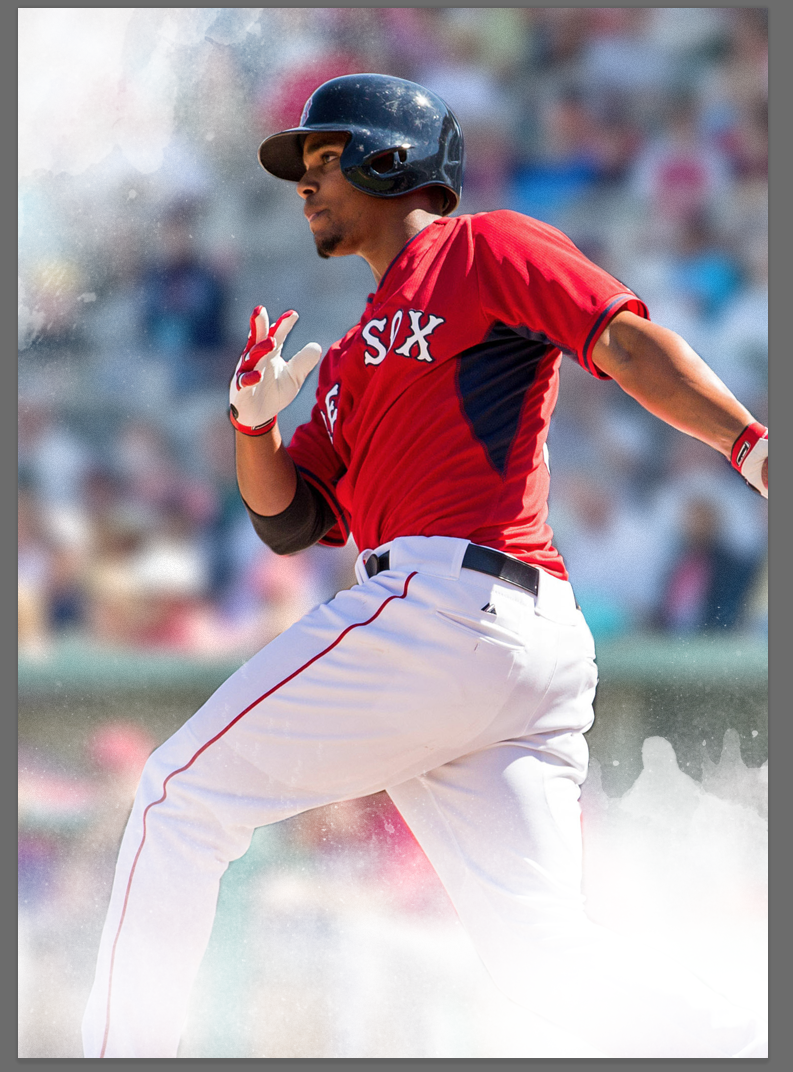
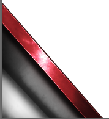
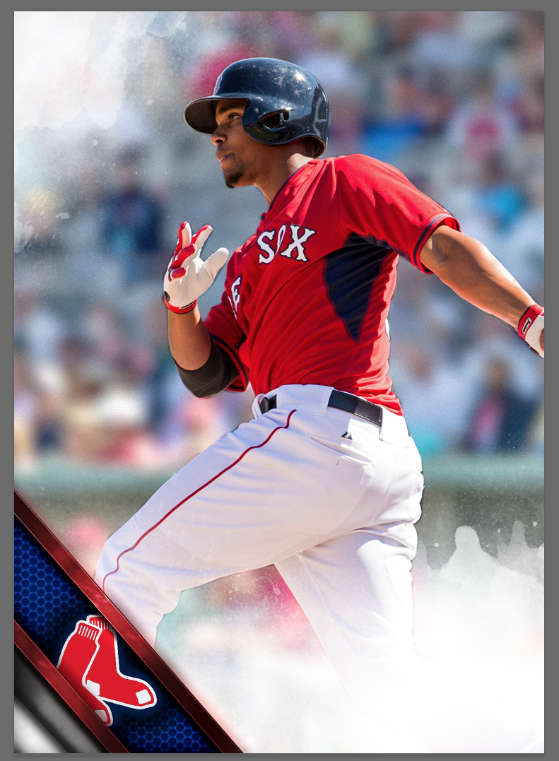
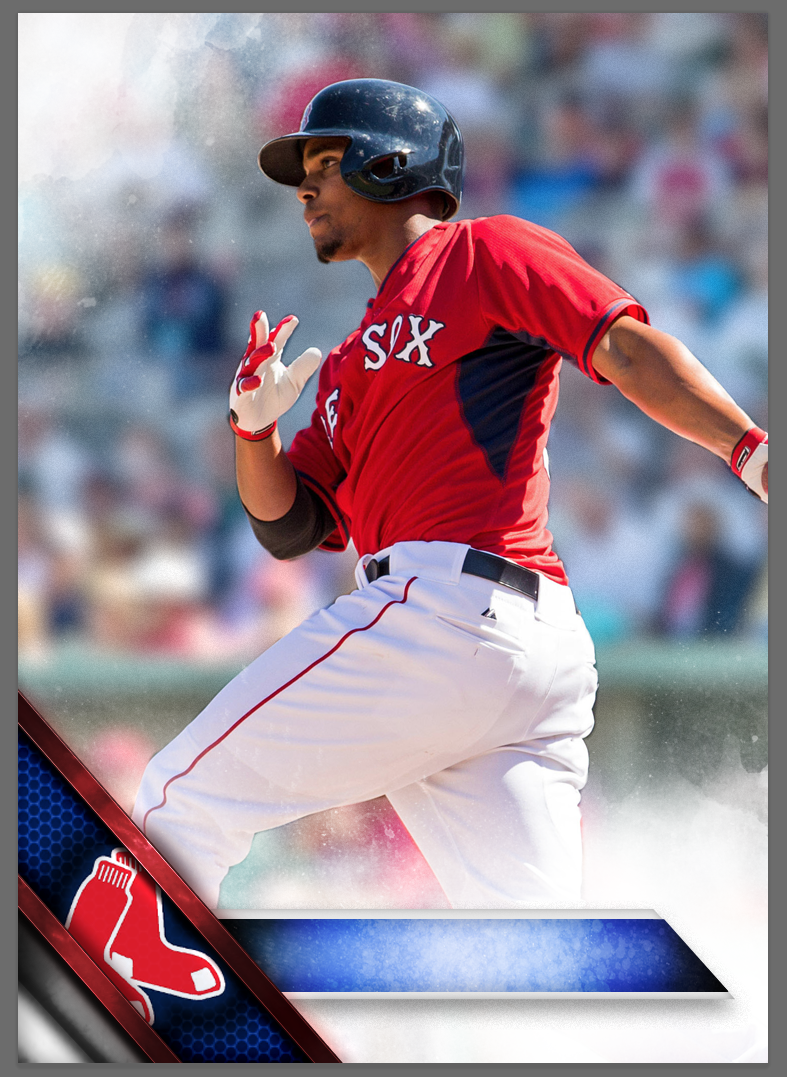
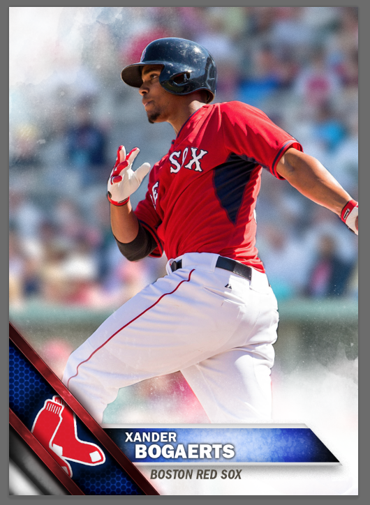
First, let’s take a look at what we’re going to be making.
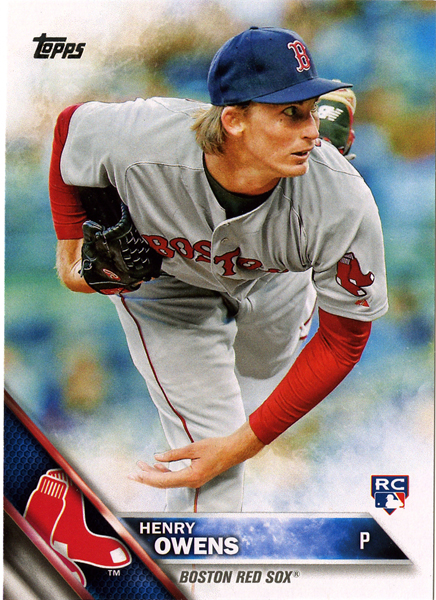
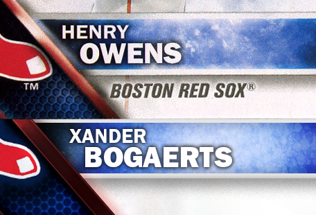
I chose this Henry Owens card to scan for two reasons. First, it has an RC logo, in case I needed it later, and second I liked the “logo on the left” version of the cards better. For the Red Sox, the left-handed version shows more of the “socks”. If you’re wanting to create a right-handed version, the steps will be similar, just remember to reverse all the angles in the various settings. Ok, let’s get going.
Part 1: The Photo
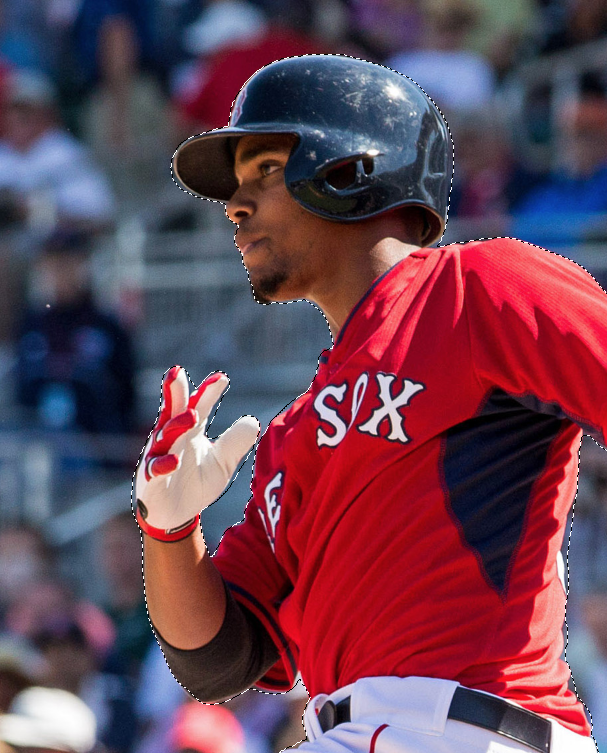
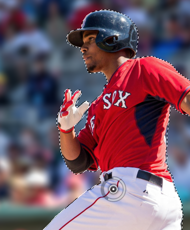
The very first thing you’re going to need is the photo of your player. I chose Xander Bogaerts because he wasn’t included in Series 1. Try to find a high enough resolution photo that you can use on a 300dpi document. By setting our document at 300dpi, we’re more likely to get better results if we ever wanted to print our card.
After finding the photo you’d like to use, open it in Photoshop and start the cutting-out/tracing process. This will be the most time consuming part of the tutorial. A good cut-out will probably take you at least 15 minutes.
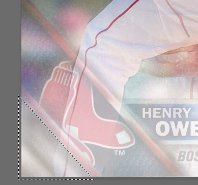
In my haste, I didn’t create a perfect cutout. If I had more time, I would have been more exact but since this was for a quick tutorial, I moved ahead. I’d recommend spending a good bit of time making your selection as perfect as you can. If you don’t, don’t dismay, neither did Topps. Notice these spots on the scan above?
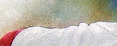
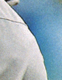
Those are from inaccurate cutouts. You’ll see why in a sec.
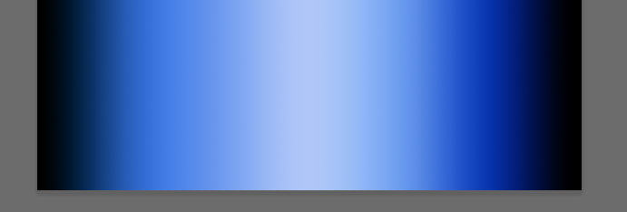
After you’ve finished creating your mask, it’s time to tweak the background to be as similar to the real thing as possible. The hallmark of these 2016 cards seems to be ultra-blurred, light, and saturated backgrounds. We can handle that.
If you’re using Photoshop CC, you’ll have access to the “Blur Tools”. Invert your mask (so that the background is selected and not the player) and choose “Field Blur”.
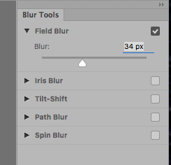
I chose 34px as my blur amount, and it resulted in this…
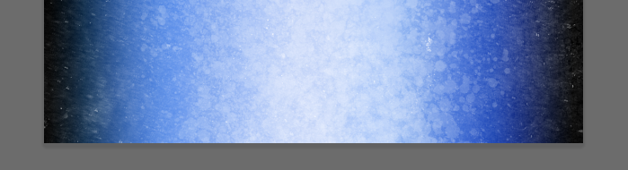
Next, add a levels layer, and push up the midpoint…

I chose 158, which made the background considerably lighter, but not blown out. At this point I decided my background had enough saturation. If yours is lacking in color, add a Saturation layer and crank it up.
Part 2: Set up your document
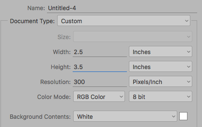
Now that we have our photo more or less ready to go, it’s time to get our card document set up. Create a new document, 2.5 x 3.5 at 300dpi.
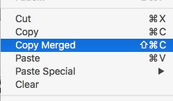
Next, go back to your manipulated photo, Ctrl/Cmd-A to select all and Shift-Ctrl/Cmd-C to Copy Merged.
Back on your card document, paste in the photo and resize it to fit your card layout. Take note of the percentages when you resize, you’re going to need those in a second.
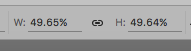
I ended up shrinking mine to 49.65% of the original.
Next, go back to your photo, Ctrl-Z to UNDO your selection and get your mask of the player back.

“Copy Merged” again and paste just the cutout of the player into your card document.
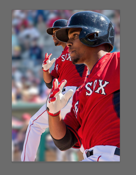
Press Ctrl-T to transform and resize the new player layer to EXACTLY the same size percentage (in my case 49.65%). Line up the two layers so that the player is exactly on top of the layer with the background, in the same position as the merged version below it. You should now have several layers that look like…
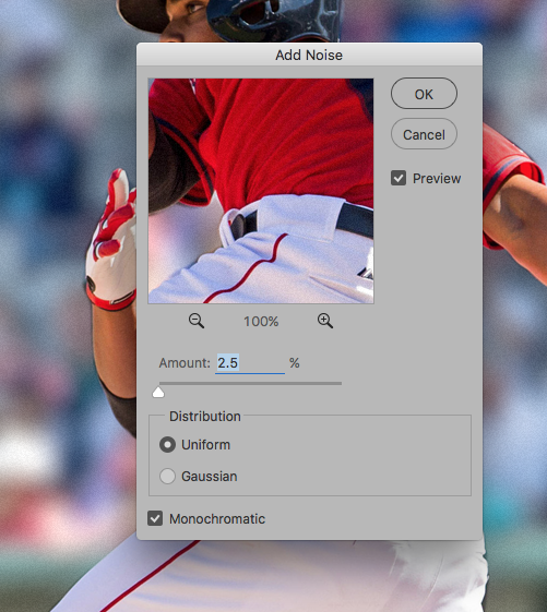
I renamed mine “player above” and “player below”, but you can leave them as layers 1 and 2 if you’d like. Next, select the layer with the background, and add a little noise. Filters -> Add Noise. Uniform and Monochrome, and just about 2.5%. This is mostly to recreate some of the printing halftone pattern, so it’s optional, but I thought it helped the background a little.
Part 3: Happy little clouds
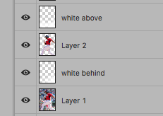
Create a new layer, between the two, and call it “white behind”, create a second above all three layers and call it “white above”. These are the two layers we’re going to paint white clouds/splatters onto. The reason there are two layers is that some of the white covers the player (usually the legs), while the other does not (usually at the top). This is also the reason we created the player cutout in the first place, so that we can work behind it, and on top of it, separately.
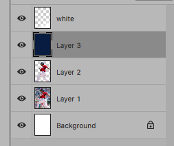
Now we need to experiment a little. For this, I temporarily created a dark blue layer (which I deleted later), so that I could test and see the results of various brushes.
If you haven’t already, now is the time to load the brushes you’ve downloaded (links at the top of the tutorial). In my brush pallet I have so many loaded I honestly couldn’t remember which ones came from which packs, but the idea is that you’re going to paint white “watercolor” or “grunge” textures into the corners.

Set your brush to white and roughly 60% opacity and 70% flow.
![]()
Now select the “white” layer above your temporary blue layer, and try various brushes. Single click, just once, you don’t have to hold and “paint” with most of these, a single click will do.
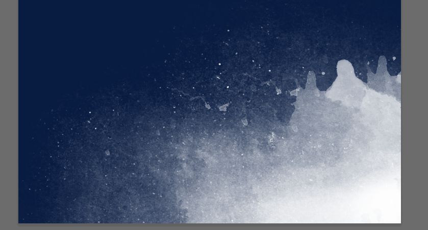
I ended up using a combination of “grunge” and “watercolor”, together (2 or 3 clicks). Remember, you can always change the angle and direction of the brush (if you have a more horizontal brush and want to use it vertically). Notice the “angle” options and the direction the compass is pointing.

The beauty of this is that it doesn’t have to be exact. Also, if you’re not happy with it simply delete the “white” layer, recreate it, and try again. Once I was happy with the bottom corner (white below layer), I selected the other (white above layer), and repeated the process. This was my result.
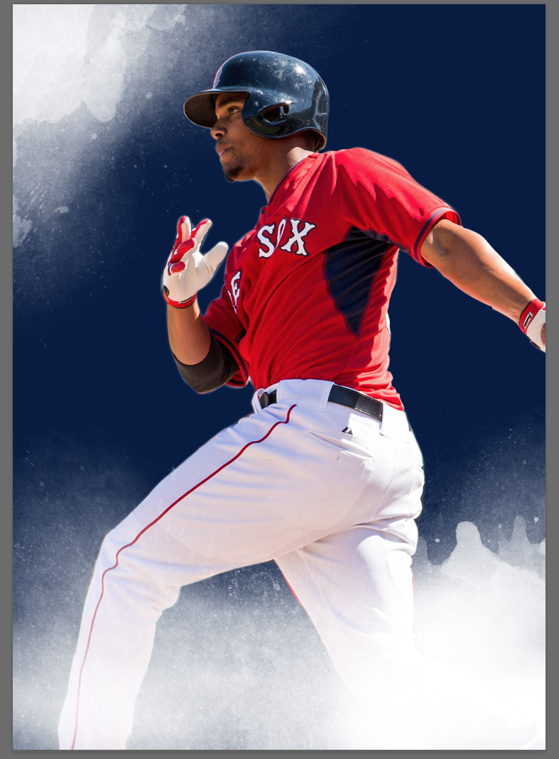
Notice how the white on the bottom covers the players legs, while the white at the top doesn’t cover his head. Once you’re happy with the corners, feel free to delete the blue layer to see how it looks with the normal background.
Not bad. Looking pretty good so far, but we’re just getting started.
Part 4: The corner stuff
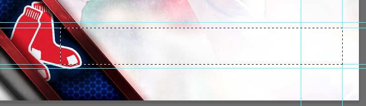
At this point, I realize I needed a guide in terms of size and placement for the graphic elements in the corner. I wanted to get the proportions correct, so copied my original scan and placed it as the top layer (and reduce the opacity).

This was merely a guide so that I could get the size of the elements correct, and I’d delete it after I was done. You’ll see it pop up in a couple more screenshots.
To start, we’re going to build the corner “metal” bits from the ground up using layer styles and a couple textures. Now would be a good time to load the textures into your Patterns palette, or to create them (Edit -> Define Pattern) if you’re making them from brushes you’ve found.
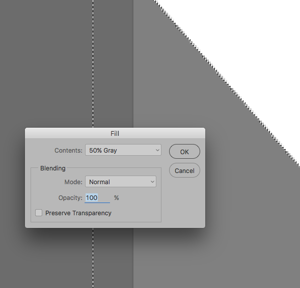
First up, the very bottom corner. Draw a triangle with the polygon lasso, or use a triangle shape layer (both will work, but you’ll have to rasterize the shape layer eventually). Fill it with 50% gray.
This bit is slightly tricky. You’re going to use the Dodge and Burn tools to lighten/darken the triangle in specific places. This is to add some of the highlights down the road that we can’t achieve with a layer style alone.
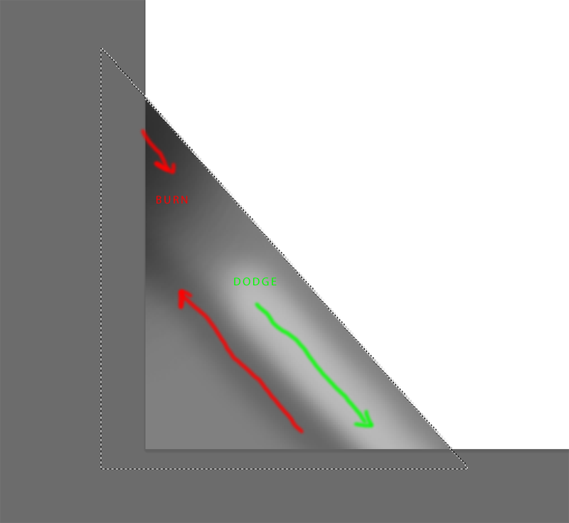
I used a medium (30px) brush for both, dodging and burning the midtones, and about 50% opacity. Dodge from the middle down to the corner, and burn up from the bottom edge to the side, and again from the top corner.
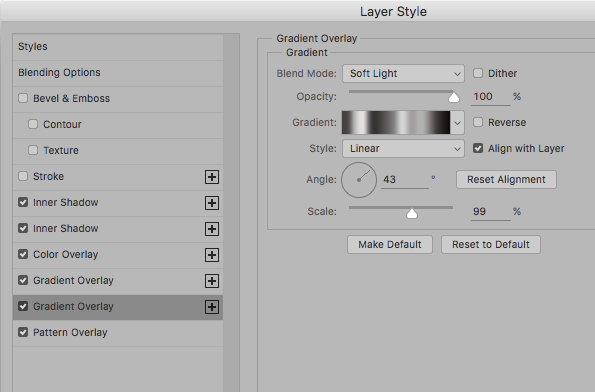
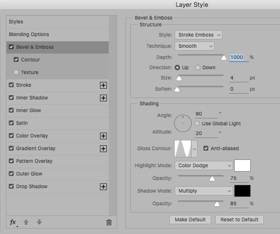
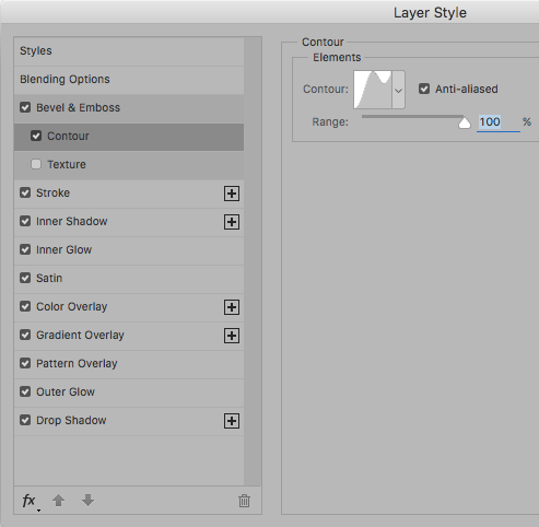
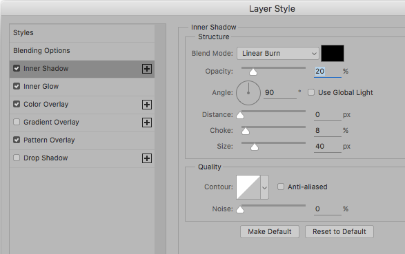
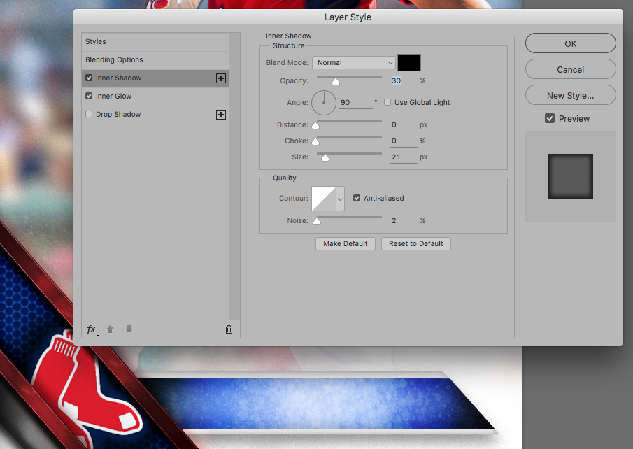
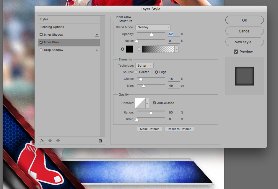
Now it’s time for the layer style. Double click on the layer and follow along with these settings.
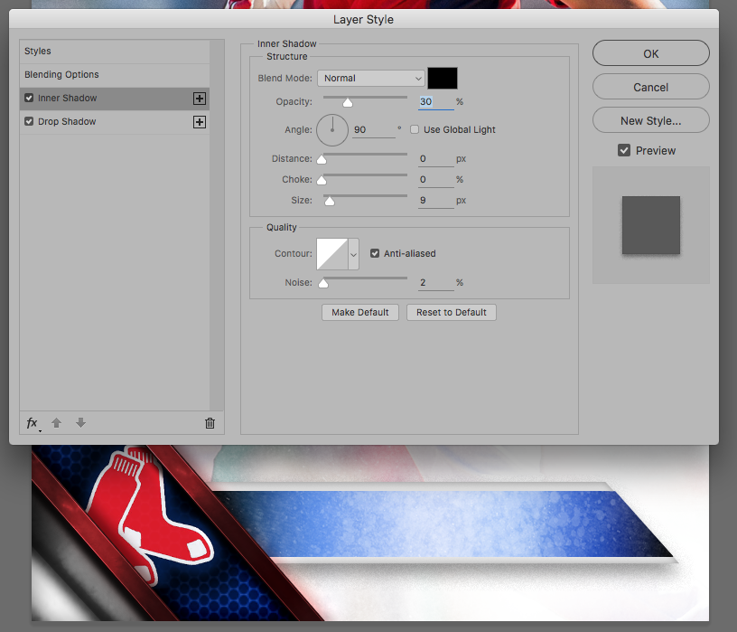
Inner Shadow: Black color, blend mode: multiply, 51% opacity, 90*, distance: 19px, choke: 0, Size: 51px, contour: soft curve

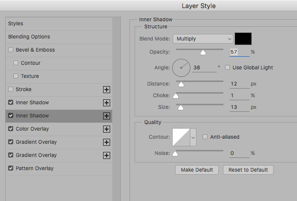
A SECOND Inner Shadow: black, multiply, 57% opacity, 38* (turn off global light), distance 12px, choke 1, size 13px, contour: strait line
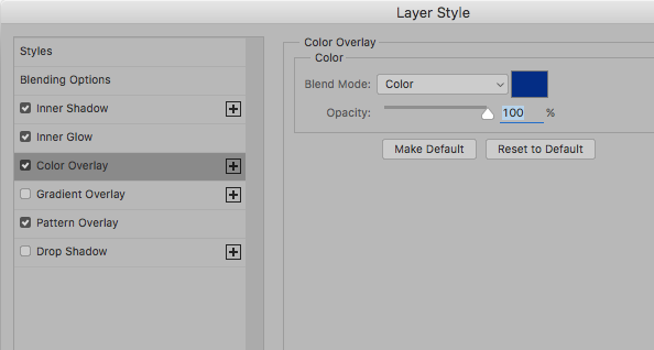
Color Overlay: Gray, blend mode: color, opacity 100%. Just in case we use a texture that has color of it’s own, this will keep it gray.

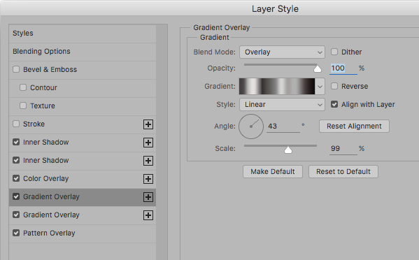
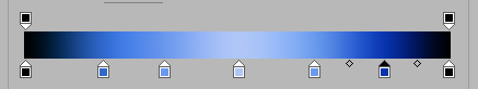
Gradient Overlay 1: Blend: Overlay, opacity 100%, gradient (see below), style linear, angle 43*, scale 99%
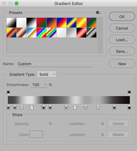
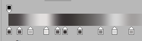
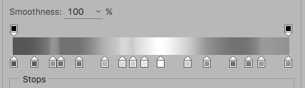
Try and recreate that gradient as best you can, it’s all gray tones. The most important part is the “hard line” in the middle, created by dragging two points on top of each other.
In case you hadn’t noticed, we’re taking advantage of CC’s handy “you can do more than one” layer style feature. We’re adding one gradient to give us a “hard” line and another for adding shadow and depth. Save this gradient to your gradient palette/presets, we’ll be using it again in a second…
Gradient Overlay 2: Blend mode: soft light, opacity 100%, gradient (see below), linear, same angle, same scale
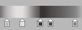
Use the same gradient, but this time remove the hard line between those two points…
Pattern Overlay: Now we need to add a little texture to our brushed metal corner.
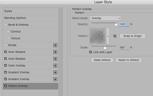
Blend: Overlay, opacity 100%, pattern (select one of your metal textures), scale (as appropriate to your texture), I used 187%.
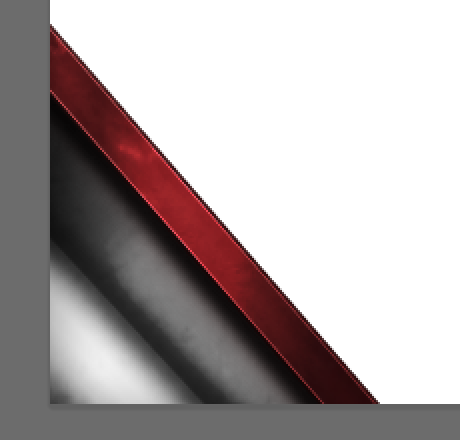
That should give you something similar to this…
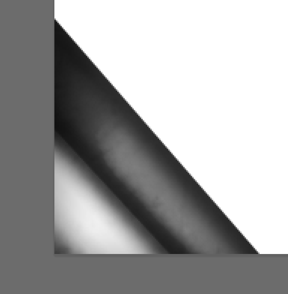
See how important that quick “dodge and burn” were at the beginning? Onward!
Part 5: Accent colors
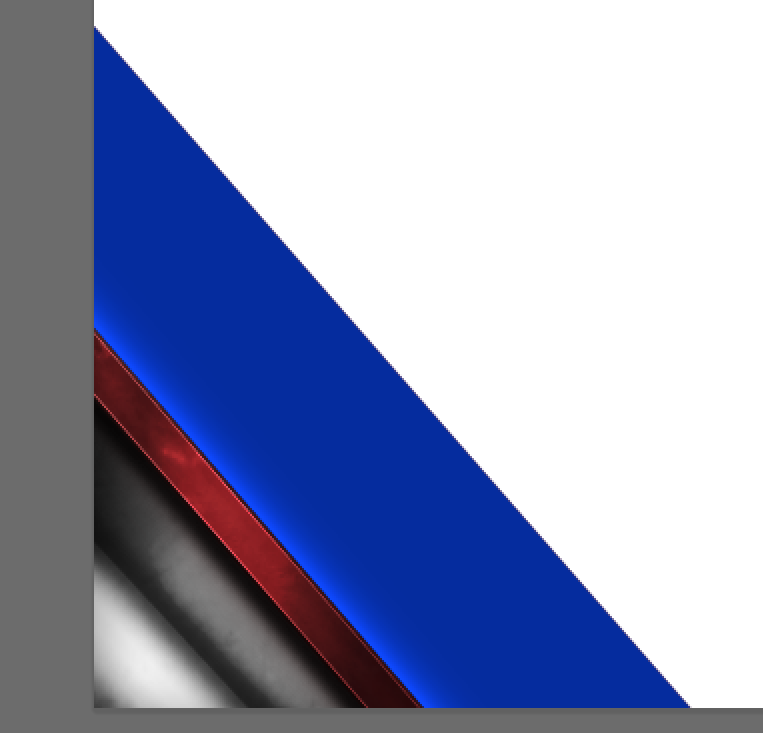
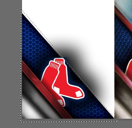
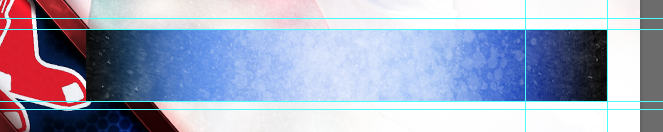
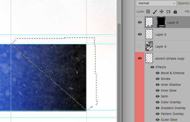
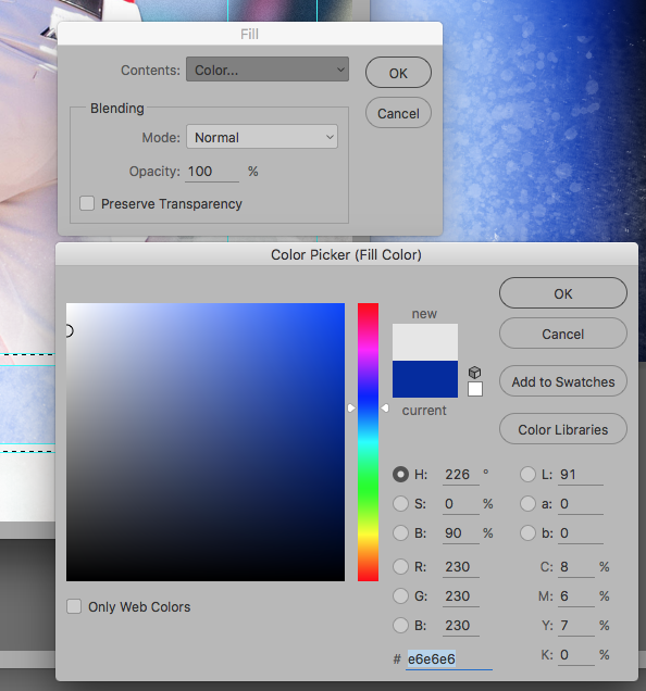
This is where I deviated slightly from the original design. I thought they were too thin and too flat, so I kicked them up a notch. Start with a stripe (polygon lasso again) and fill it with the color your accent is going to be, mine was going to be red.

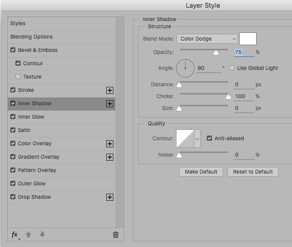
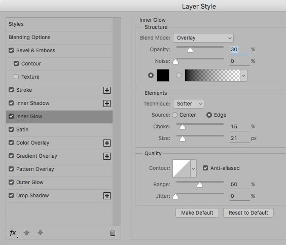
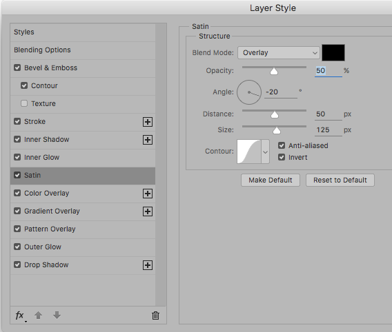
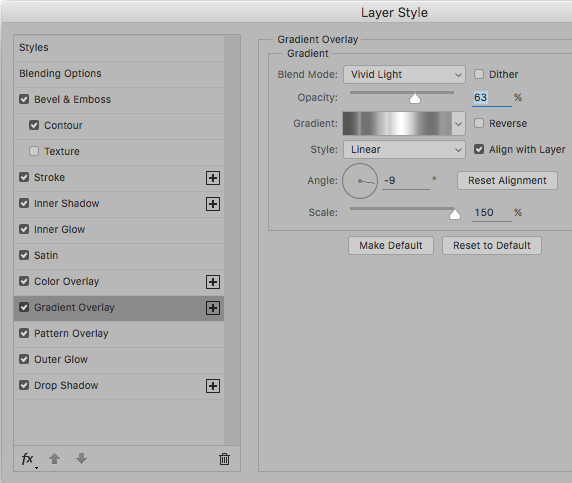
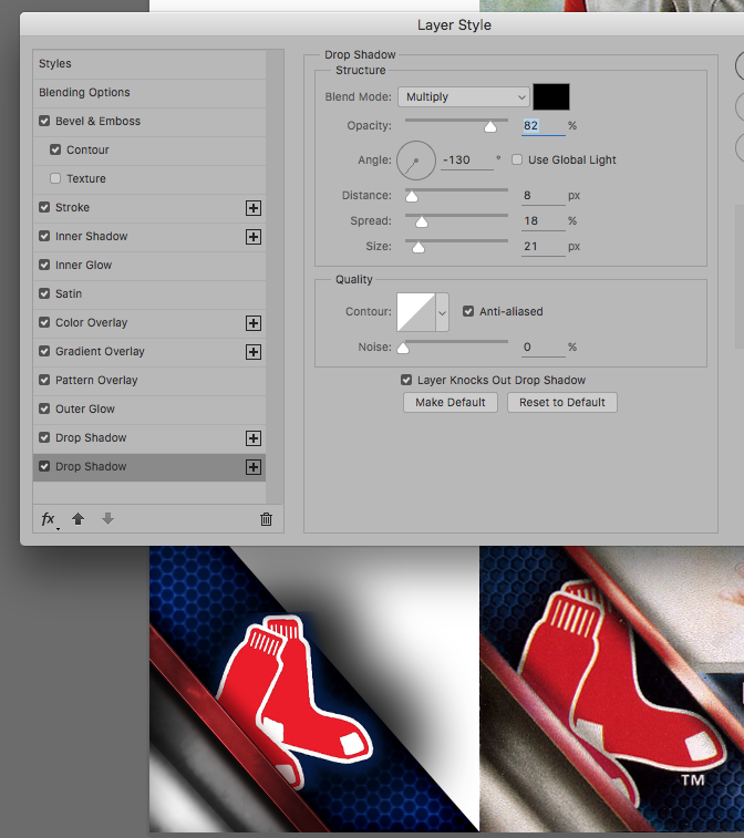
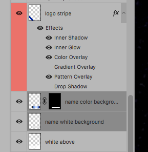
Now to add the layer style. This is a huge and complicated layer style, so I took lots of screenshots. At the end, you’ll have: Bevel & Emboss, Contour, Stroke, Inner Shadow, Inner Glow, Satin, Color Overlay, Gradient Overlay, Pattern Overlay, Outer Glow and a Drop Shadow.
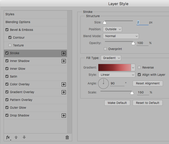

That should give you something like this…
You can adjust the “bright spot” of the gradient buy editing the angle and scale in the gradient overlay settings, experiment to find out what you like. I added some texture and toned it back a little with…

(another metal texture)

Outer Glow (to help punch up the edges)

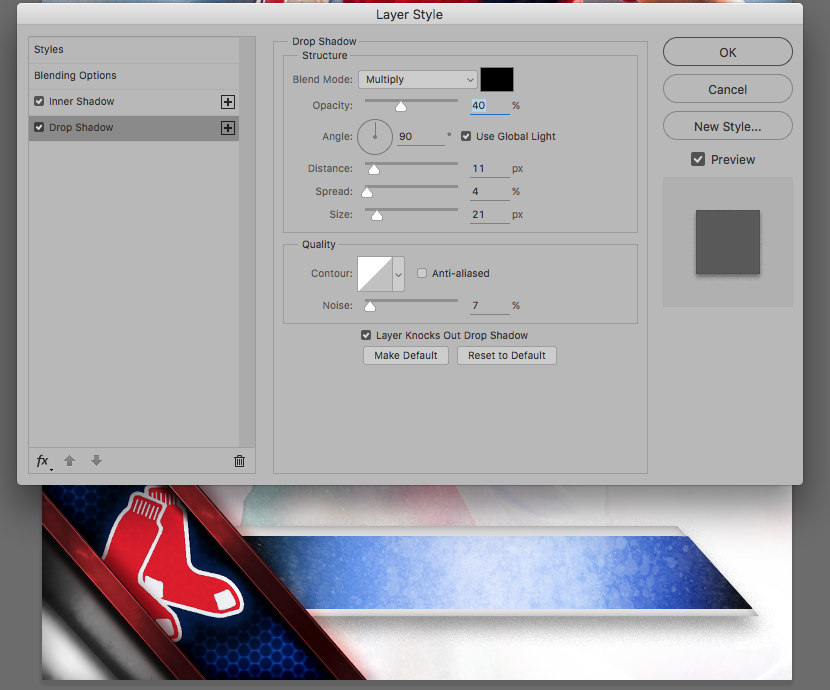
Drop Shadow to make it look “above” the other layers (still to come). That all resulted in this…
You can’t see the outer glow yet, but it’s there. Lets put something underneath it.
Part 6: Weird center mesh thingy
Again, create the shape and fill it with your color of choice. This one is actually a deceptively easy layer style, but it took forever to find the right pattern. I’d suggest using the “Spiderman” pattern liked at the top of the tutorial, it’s nearly perfect for what we need.

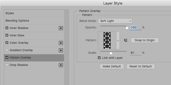
Obviously, change the color in your Color Overlay to match the color you need. Also, adjust the scale of the pattern to fit, I used 81% and it seems just about right.
After you’ve applied the layer style, move that layer down, below the accent stripe layer…
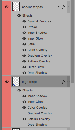
Now it’s time to paste in your teams logo. Do whatever you need to do to prepare it (I had to cut mine out from a blue background), and paste it above the stripe we’ve been working on, but below the accent stripe layer.
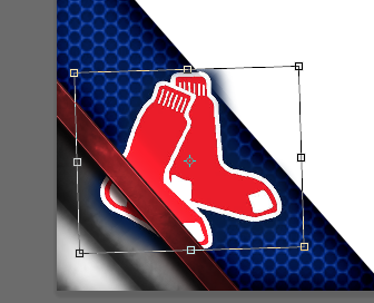
At this point I realized I needed to also move the “gray corner” above the logo as well…
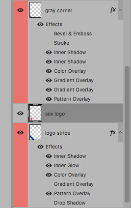
After a quick layer reorganization, the logo and logo stripe are now at the bottom (but above the player, clouds and photo obviously). Now we need to adjust the heavy drop shadow a bit.
This was applied to the “logo” layer.
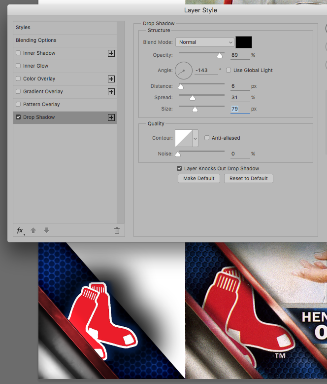
I also included the original for comparison. I was constantly checking to see how close I was getting with my recreation. When I did, I noticed there was a slight Drop Shadow, from the Accent Stripe, onto the logo, so I added that in…
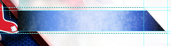
Next we’re going to duplicate the Accent Stripe and move it above-right of the logo.
This is where you should be at this point…

We still need a couple tweaks, but it’s coming along nicely. At this point I created a quick mask to try and knock down some of that drop shadow from sticking out. Try that if it’s a problem with your team’s logo…
The last bit is to make the top accent stripe slightly different from the bottom one. I did that by tweaking the angle of the gradient overlay…
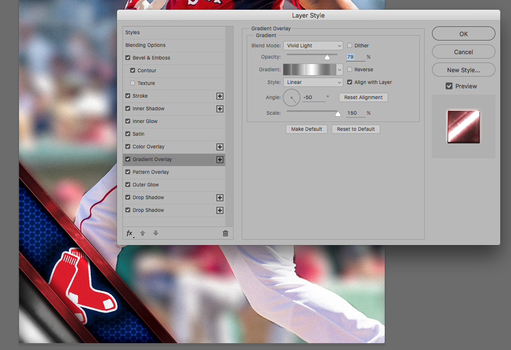
By moving the angle, it moved the highlight spot further up on the stripe. Let’s see where we are so far…
Definitely a good time to save
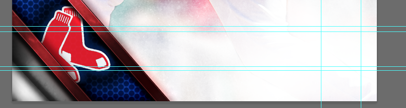
Part 7: The Name Plate
Using an original as a guide, I marked out where the name plate was going to land using guides in Photoshop…
Next, create a new document (you could, technically, do all this inside the main document, but I just found this easier), we’re going to be using our textured brushes again. I did something generic like 1″x3″, it doesn’t need to be large. Next, create a basic black-to-color-to-black gradient. Whatever color your team uses for the name section, or whatever color you want. Here was mine.
Next, we’re going to be using our brushes again, just as we did with the white corners. I chose a light grunge texture, and clicked once or twice with a low opacity white color…
This is what we’re going to paste into the name area as a background. Select all and copy.
Use the marque tool and select the INNER lines/rectangle of your guides. Create a new layer and Edit -> Paste into.
Next, we need to take off that corner.
Using your polygon lasso, draw a triangle from inner corner to corner of your guides (see above). Then, select the layer mask that was create when you “Pasted Into” that layer, and fill that triangle with black, making it disappear.
Now we need to create the white behind that name plate. Using the lasso again, with the guides, trace the outer shape.
Create a new layer, below the name plate layer…
And fill it with nearly white (like 5% gray)…
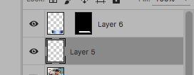
Now would be a good time for a little rearranging as well. Move those two layers below the rest of the corner elements, if they weren’t already…
Two quick tweaks (layer style) to these. First on the white background layer…
And to the colored middle of the name plate…
There we go, now we’ve got a little depth. Lets see how it’s all coming together…
Not bad! Almost done.
Part 8: The fonts
The hardest part (at least for me) is getting the fonts to be a perfect match. Some people don’t care and will just put Arial or Helvetica on everything, and those are certainly options. The fonts Topps are using are easy to read San Serifs, but not ones that you probably have. If you’re a font nerd like me, tracking these down is half the fun. After some investigation, I’ve come to believe the names are written in Franklin Gothic, and the team names in Craft Gothic. Both are paid fonts, but luckily for me Franklin Gothic is part of my collection. If you’re interested in Craft Gothic, it’s for sale at Font Spring for $46. I found that Franklin was close enough for the team names, so I used that, but if you want to be 100% authentic, I’d recommend checking that out. Also, if you happen to have Novecento, Fuller Sans and Foundation Sans, they seem to be acceptable replacements as well.
Anyway, here’s what the names look like in Franklin Gothic.
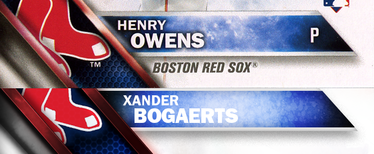
Pretty close. Needs more cowbell Outer Glow.

There we go. As I mentioned, the “Boston Red Sox” should really be Craft Gothic, which has a slightly more boxy feel, but Franklin Gothic is pretty close. I used Italic Demi Condensed for the team name…
And that’s it! We’re done.
I hope you enjoyed the tutorial. For those eagle-eyed among us, you’ll notice I didn’t add the Topps logo to the top corner. Feel free to do that if you’d like, I put one on the teaser for the tutorial, but I think I’m going to leave it off my customs. As always, if you have any questions, feel free to ask!
Waaaay beyond me but this is awesome. Wish I knew Photoshop well enough to do this for TTM customs.
Question, because my knowledge of Photoshop is slightly above novice level:
Is there a way to save all those layer styles that make up the left-hand corner as a preset so as not to have to constantly re-enter them? It looks like something I would like to use in the future for other projects, but doing about 9 different styles gets time-consuming.
There is! In the layer style options panel, when you’re done creating it, look to the right. There should be “Ok”, “Cancel” and “New Style”. By clicking “New Style” you’ll be asked to give it a name and add it to your layer style collection. Once you’ve done that you can access the saved styles anytime (Window -> Styles) and clicking one will automatically apply it to the current layer with the saved information.
Hope that helps!
Thanks Matt! I saw this mock-up last Friday and knew I had an all-american award or two that would be announced later in the day, so here’s an example of how I used your tutorial. Not perfect (struggled with the other three corners, especially) but it turned out pretty well.
https://twitter.com/RU_Eagles/status/738810743504654336/photo/1