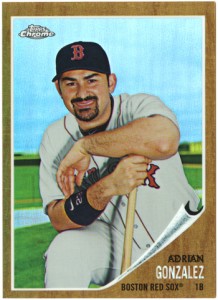
I’m not really sure if it’s a “we’re terrible at quality control” problem, or if it’s a “this is a rare, one of a kind screw-up” sort of thing, but I’ve got a messed up Chrome Refractor I wanted to share and maybe get a second opinion on.
I got this card, a 2011 Topps Chrome “Heritage” Refractor of Adrian Gonzalez, numbered 199/562 out of Sam’s Chrome Group Break a while back. I honestly didn’t notice it was a refractor version until today. I was looking at the numbers on the back and it was out of 562 as opposed to the normal 1962 that the rest of the Heritage cards are. I wasn’t even aware that those inserts had a refractor variation, but then again, nothing like that from Topps really surprises me any more. If there’s a chance to have a parallel, they’ll do it.
Notice anything weird? Look close.
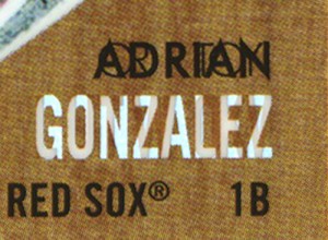
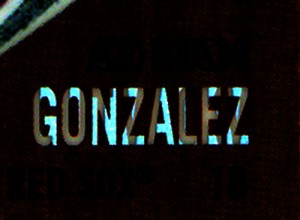
The printing on the name is all jacked up. Not the card, the photo and the design look perfectly aligned and the printing is actually pretty good. There’s additional letters, in a different font, printed on top of the word “Adrian”, in black ink. Then, only in the refractor part of the foil, there are additional letters printed over “Gonzalez”, but only in the foil, not in the white of the font. So, it’s screwed up in two different ways, using two different printing techniques, in two different parts of the process. Knowing what I know about printing, the foil part is usually a separate layer from the color and the black would go down durring that normal color CMYK process.
If I enhance it in Photoshop, you can see that (on the scan) the reflective part is brighter when it crosses over the white of the name…
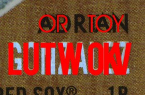
Using a little detective work, you can make out what the letters are, or at least what they were supposed to be…
Or Toy Lutwokv? Some how I doubt that’s the name of a up and coming Korean Russian rookie. The OR or TOY could almost be explained if these were being printed in a sheet and it was misaligned and those where the last and first letters of two peoples names. Problem with that is that they wouldn’t be that close together on the sheet and it’s in a completely different font from the normal card font. Second, the last name is completely garbled. Not only have I never heard of a player who’s last name starts with OKV, but the kerning is all off.
I’m willing to bet someone in the art department left a Photoshop layer turned on and forgot about it.
It makes me wonder if this affects all Gonzalez heritage cards, or just mine. If anyone else has one of the 561 others, please let me know if your card looks the same. Also, if you have any of the refractor versions of those cards, check them and see if your printing is messed up too. I’m just wondering if this is unique, or a complete screw up of the entire set.


Hey, I have the regular refractor version… numbered /1962… the OR TOY portion is screwed up there, but the part in the Gonzalez part isn’t. So yea, I think they screwed up different layers like you said. Weird… I had noticed it in the group break but chalked it up to possibly how Topps reproduces production mistakes within their vintage sets as well. Anyways, nice catch. When I first saw your post, I thought “Troy Tulowiski” but not all the letters are right or in the right order…