Alright Photoshop warriors, it’s tutorial time. A couple pre-requisites for this one. PS CS4 and above required for this one. I believe it was CS4 that added some of the HDR options we’ll be using. I’m using CS6, but 4 and 5 should be more than sufficient. Also, right off the bat, you’re going to need a really large source file. If you’re looking to use a 200k screen grab of your favorite player, you’re going to have a bad time, but more on this in a minute.
Alright, let’s outline what we’re trying to do: We’re trying to recreate the photo effect used on Topps Gypsy Queen baseball cards. I would describe this effect as High Dynamic Range coupled with copious amounts of grain. It’s just surreal enough to have an almost painterly look to it.
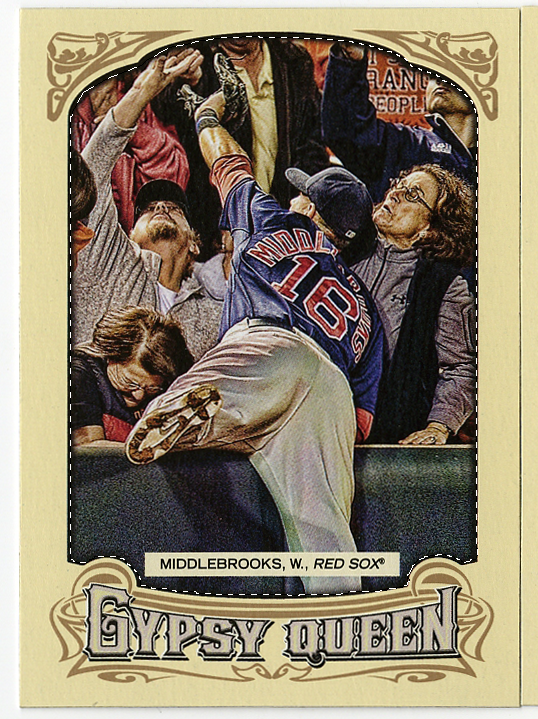
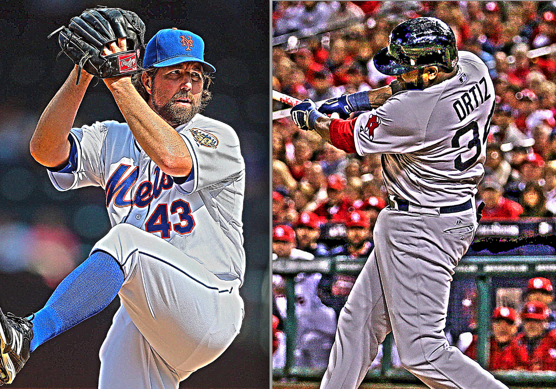
So, where do we start? Well, let’s take a look at an original. Here’s a scan of David Wright’s card that I received in pack just yesterday.

Take note of a couple things. First, the deep shadows and line within normally bright areas, which is part of the HDR process. His pants are a good example of this. Second, grain and exaggerated blurring of the background. Take a look at the “line” of the top/front bar of the seats behind him, it’s both fussy and grainy. The fan in blue, to the left of his helmet also shows some of this. Part of this is due to it being out of focus in the original photo, but part of it is exaggerated by the process as well. Lastly, strong lines and shard contrast. Look at the line of his helmet brim compared to his face, or the woodgrain on his bat. This exaggerated contrast is also a hallmark characteristic. I should point out that the combination of these three things is normally apparent in modern players photos used for this card line. Original period photos used for some of the legendary players have more subtle versions of this effect, most likely do to the soft focus of the original photo. That’s part of the reason why a high-res photo is highly recommended to start with. The larger and higher resolution the better. A small low-res or blurry photo is just going to get you a blurry end product.
Your best bet is to go Google it, and make use of the additional filters for size. I wouldn’t bother using anything less the 4MP.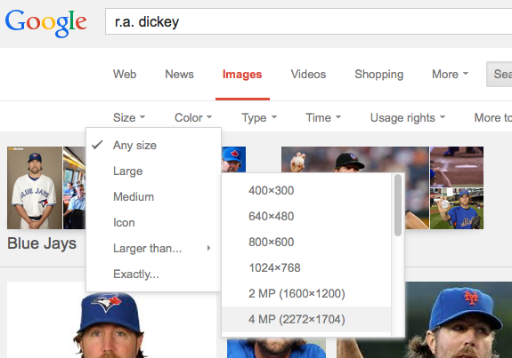
Ok, so, now that we know what we’re looking for, how do we get it?
Let’s start with the toning. HDR or High Dynamic Range is a popular technique in photography, used for both extending otherwise weak dynamic range, or for exaggerated effects. Thankfully, Topps artists didn’t go overboard with the effect. Some HDR techniques are, in my opinion, complete overkill.
Step 1: HDR Toning
After opening your photo in Photoshop, let’s apply our first effect.
Go to Image -> Adjustments – HDR Toning.
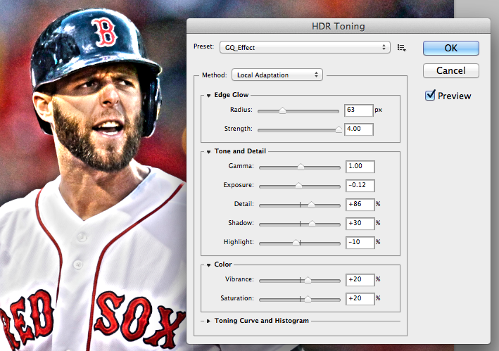
Here were my settings:
Edge Glow Radius – 63px
Strength – 4.00Gamma – 1.00
Exposure – -0.12
Detail – +86
Shadow – +30
Highlight – -10
Vibrance – +20
Saturation – +20
Why these settings? For starters, we’re looking for hard edges and contrast. A good sized “Edge Glow” and “Strength” cranked all the way up gets us started. Glowing edges are bright, giving us contrast. Gamma stays normal at 1. My original photo was a little on the bright side, so I under-exposed it a little (-0.12). Detail at +86 is one of the more important pieces. Any high setting will harden edges and retain the detail we’re looking for, but it’s easy to go overboard and set it too high. We’ll be adding more detail and sharpening later, so you don’t have to go too crazy. Shadows +30, making them a little lighter. Highlight is going to depend on your photo. I wanted to see the texture in the jersey, but the jersey was bright white, so -10 darkened it enough to pull out the details. If you have a player with a dark jersey, you might have to go the other way on that setting. Saturation and Vibrance are both color settings and we want deep saturated colors, so +20 for both of them.
Note: These are the essential settings to play with in Photoshop. They are the base levels for everything else. Adjust these numbers to suit your specific image and your specific tastes. Experiment to see what you like the best.
Step 2: Making spots!
Ok, so now we’ve pulled out some of the dark and light tones, but it looks a little blurry and flat. That’s ok, it’s time to add some texture.
Start by duplicating you layer again. Now press “D” on your keyboard to reset your colors to black and white, we’ll be needing the white as the background color. Next, on your new layer, go to Filter -> Pixelate -> Pointillize
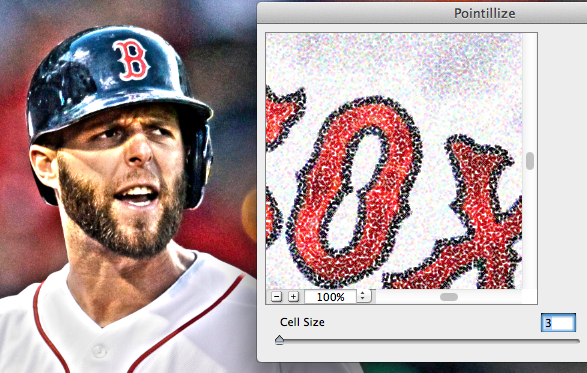
Set the cell size all the way down to 3. We want tiny points, not big ones.
You’re picture will now seem lighter (because white was our background color). That’s ok.
Step 3: Layer Blending
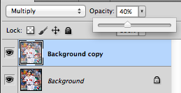
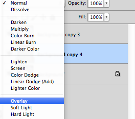
Make sure the current layer (top most) is selected. Now change the layer blending style to Multiply and drop the Opacity to less than 50%. I used 40% in my example.
Step 4: Sharpen
We’re doing good, we’re almost there. Our photo just needs a little punch though. Now, select the original layer, the one you did the HDR toning to. We want to keep the Pointillized layer above it, so we’re going to go back to the toned one.
On this layer, we’re going to sharpen. Go to Filter -> Unsharp Mask
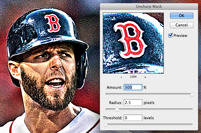
We’re going to crank this all the way up.
Amount 500%
Radius 2.5px
Essentially, you’ve just told it to make it the maximum amount of “crunchy” sharp it can manage… but to do it only within 2.5px. This is great for really defining some hard edges.
At this point you’re more or less done with your image. I was happy with the results at this point and went on to making the card mockup. There are a few optional steps however. IF your photo is lacking contrast, is semi-blurry, or you think it just needs a little extra kick, you can do the following. Note: I did NOT need these steps in my original. Your mileage may vary.
Optional Step 5: High Pass
First, duplicate your background layer. Selecting the now “middle” layer, go to Filter -> Other -> High Pass. I used a setting of 16.4px. Don’t freak out about the gray background and weird tones. We only want this layer for it’s contrast.

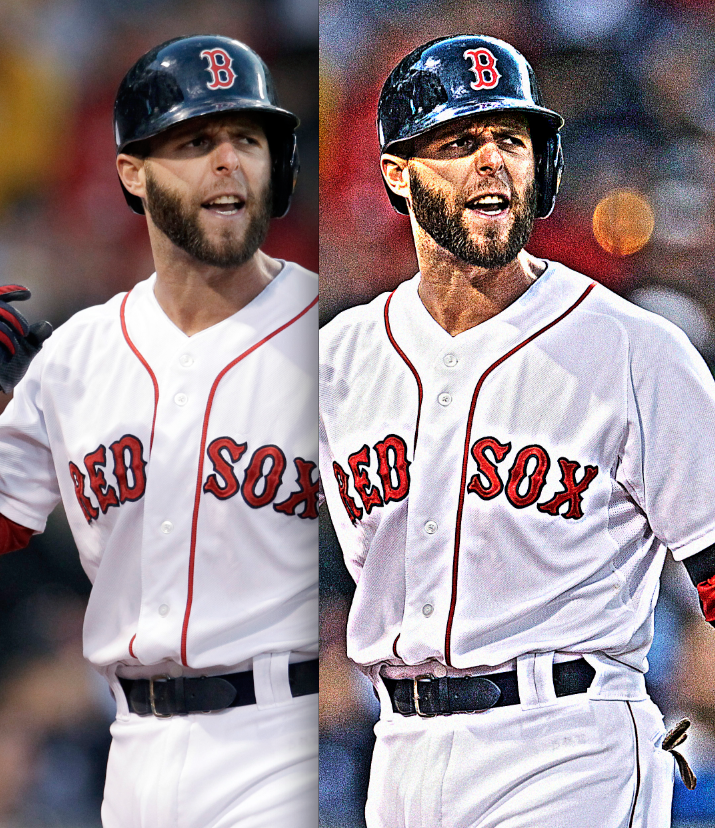
Next, change the blending mode of this middle layer to “Overlay”, and adjust opacity to your liking. This should have made the grain really pop. Here’s my original next to a version with the High Pass filter. I thought it was too much, so I left it out of my original.
So, now that we have our image, lets check some of the details to see if we’ve achieved the look we’re aiming for.
Additional tone in otherwise flat areas. Check.

Good details. Check.
Epic grain. Check.
Sweet. So, now that we’ve got our photo, how do we get it into a card? Well, the easiest way is to just use a card that you have. I wish I could distribute a blank card frame to everyone, but I’m pretty sure Topps would frown on that. So, “scan’em if you got’em”. Once you have you frame, it’s time to cut out the player.
Steps 6, 7 & 8: Making the card
Start with your Lasso tool, feather at 0px, and work your way around the inside edge of the frame. Don’t worry if it’s not exact, we’ll be adding a shadow to help cover up any rough cuts anyway.
Next, with the frame still selected, go back to your other image, select All (Command/Ctrl-A) copy (Ctrl-C) the entirety of your newly modified image and get ready to paste. Go back to your frame image, create a new layer and go to Edit -> Paste Special -> Paste Into.
This will paste your image within the confines of your selection, giving you a layer mask in the process. Ctrl-T to resize the image to fit how you’d like it in the frame.
The edges will be a little rough, as seen here. Let’s cover those up.

Double click on your newly pasted layer and create a new layer style. Add an “Inner Shadow”. I used the following:
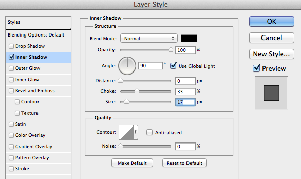
That should give you a nice inner shadow along the inside of the frame, just like the originals.

We’re almost done. The only thing left is a new name plate. Since we just pasted over it, it’s simple enough to recreate.
Steps 9 & 10: The name
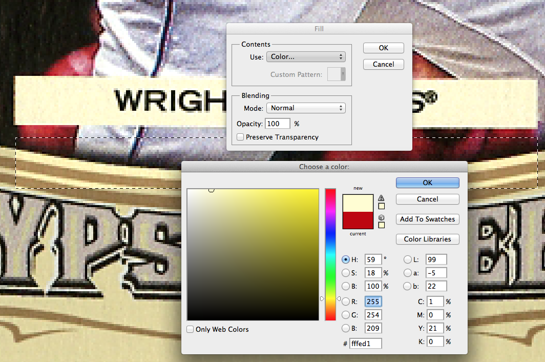
Draw a small rectangle with the Marquee tool and fill it with #FFED1.
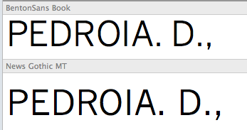
Next, the font. After trying a few dozen, I went through my font libraries and stumbled on Benton Sans. It’s a premium font that not everyone has, but it’s pretty spot on, as you can see. I believe it’s about as close as we can get to what Topps used.
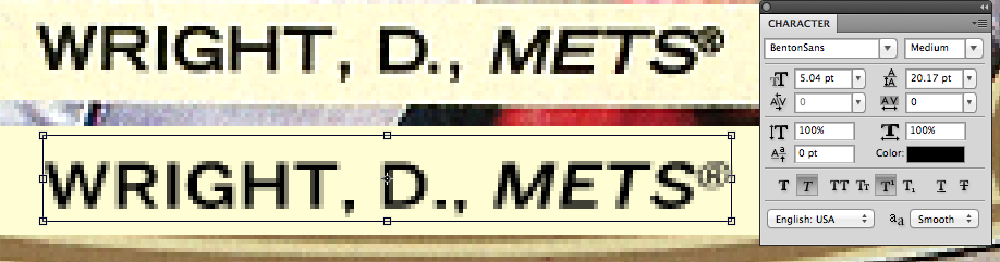
The next best thing to Benton Sans is News Gothic, which you can find randomly around the internet if you look hard enough. It might even be included with the Adobe Creative Suite, but I’m not 100% on that. Of course, Benton and News Gothic are for maximum authenticity, most of your standard sans serifs will work as well. FontSquirrel has dozens that would work that are completely free. Mueso Sans or Nobile aren’t bad choices.
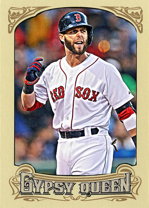
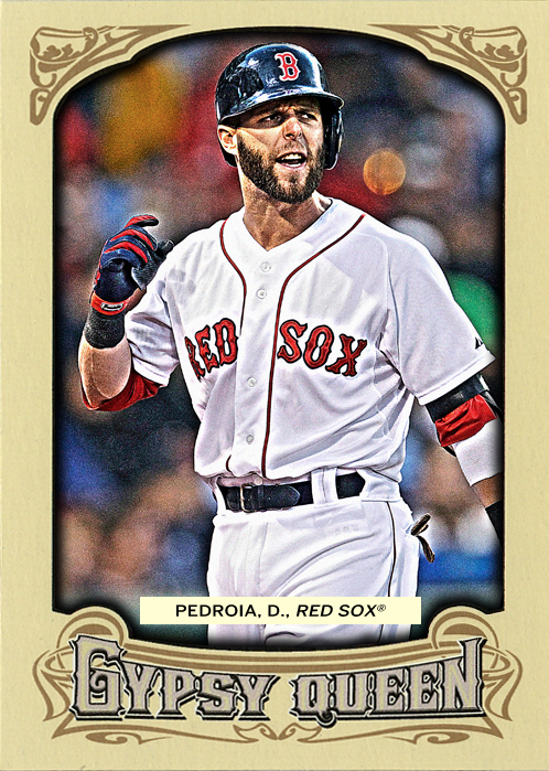
So, there you have it. My version of the Gypsy Queen effect. Here are the final results, as well as a couple other examples. Comments and questions are always welcome.
Recent Comments